What is CMYK?
Understanding CMYK colour for print
CMYK is the standard colour model used for full-colour printing. The letters CMYK stand for Cyan, Magenta, Yellow and Key (Black) – the four ink colours used to reproduce a wide range of colours on paper and other printed materials.
If you have ever supplied artwork to a printer, you have probably been asked whether your artwork is CMYK or RGB. Understanding the difference is important because the colours you see on your computer screen are produced differently from the colours produced by a printing press or digital printer.
What does CMYK stand for?
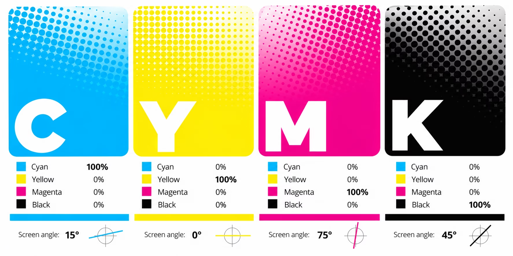
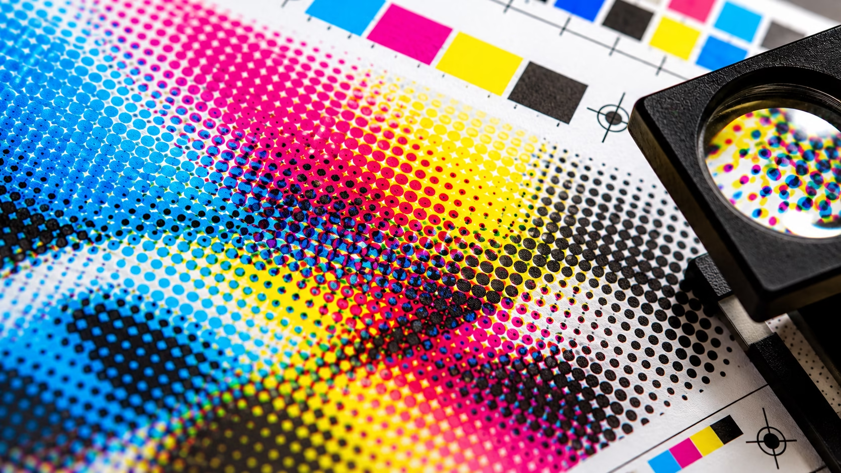
These four process colours are used together to reproduce thousands of different colours in printed material. Rather than mixing the inks together before printing, CMYK printing normally applies the four colours separately. Tiny dots of cyan, magenta, yellow and black are printed in different percentages and patterns. When viewed from a normal distance, our eyes combine these dots to create the appearance of continuous colours and images.
This process is known as four-colour process printing or CMYK printing.
How does CMYK printing work?
CMYK is known as a subtractive colour model. Unlike a computer monitor, which creates colour by emitting light, printed ink works by absorbing certain wavelengths of light and reflecting others back towards our eyes. The four inks work together to remove different parts of the visible light spectrum:
Cyan, Magenta and Yellow are the three primary process colours. By combining them in different proportions, a very large range of colours can be reproduced. Black is added as a separate ink for several important reasons. In theory, combining cyan, magenta and yellow in equal amounts should produce black. In practice, the result is usually a dark, muddy brown or grey rather than a strong, clean black.
The addition of a dedicated black ink provides a much stronger black, improves contrast and allows printers to reproduce text and fine detail more accurately. This is why the fourth colour is referred to as K – Key, rather than simply B for black.
Why is black called K in CMYK?
The K in CMYK means Key, referring to the key plate used in traditional printing.
The black plate traditionally carried the key detail of an image, particularly the important outlines and definition. Using K also avoids confusion with B for Blue, which is used in other colour models and printing terminology. So, although K technically means Key, it is the black ink in a CMYK printing process.
How are thousands of colours produced from CMYK?
A CMYK printer does not need a separate ink for every colour. Instead, different percentages of cyan, magenta, yellow and black are combined to create the appearance of many different colours. In conventional printing this is achieved using very small halftone dots.
For example, a particular area of a printed image might contain:
- 100% Cyan
- 20% Magenta
- 0% Yellow
- 0% Black
Another area might contain a completely different combination. The dots are extremely small and are arranged using different screen angles and frequencies. From a normal viewing distance, the individual dots blend together visually to create the colours and tones we see. This is one of the fundamental principles behind traditional four-colour printing.
CMYK and your computer screen
This is where CMYK can become confusing. The colours displayed on your computer, tablet or phone are generally created using the RGB colour model. RGB stands for:
- R – Red
- G – Green
- B – Blue
RGB is an additive colour model. Your screen produces light using red, green and blue light at different intensities. Combining these light sources can produce a very wide range of colours.
Printing works differently
Ink does not produce light. It absorbs and reflects light. This means that the range of colours available in print is generally smaller than the range that can be displayed on a modern screen.
The range of colours that a particular device, colour space or printing process can reproduce is called its colour gamut.
Why can’t RGB colours simply be printed?
RGB and CMYK describe colour in different ways. RGB creates colour using emitted light, while CMYK printing uses inks that absorb and reflect light. When RGB artwork is reproduced using a particular CMYK printing condition, colours outside that condition’s gamut must be mapped into the range the process can reproduce. Bright greens, vivid blues, intense oranges and some highly saturated colours may consequently appear less vivid in print.
A colour-managed conversion uses the appropriate ICC profiles and a rendering intent to determine how colours are mapped. The result depends on the source colour space, destination printing condition and conversion settings.
For important work, soft-proofing in a colour-managed application can help identify significant changes before the job is printed.
| RGB | CMYK |
|---|---|
| Red, Green, Blue | Cyan, Magenta, Yellow, Key/Black |
| Used for screens | Used primarily for print |
| Additive colour | Subtractive colour |
| Creates colour with light | Creates colour with ink |
| Generally has a larger gamut | Generally has a smaller gamut |
| Ideal for websites and digital media | Ideal for printed artwork |
Neither colour model is inherently “better”. They are designed for different purposes. RGB is the right choice for images and graphics that will only be viewed digitally. CMYK is normally the appropriate colour model when artwork is being prepared for conventional full-colour printing.
What is CMYK in the printing process?
CMYK printing reproduces full-colour images using four process colours: Cyan, Magenta, Yellow and Black.
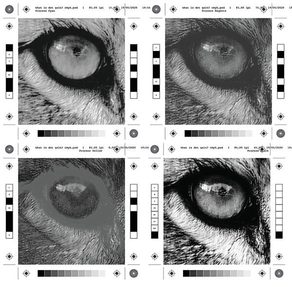
In conventional offset lithography, each colour is transferred from its own printing plate to the paper. The four inks are applied in register, combining to reproduce photographs, illustrations and other full-colour artwork.
Digital printing achieves a similar result without necessarily using physical printing plates. Depending on the technology, a digital press may use toner or inkjet inks, with a digital front end and raster image processor (RIP) converting the supplied artwork into instructions for the printing device.
Both methods rely on controlled colour reproduction, but the production process, available colour gamut and print characteristics can differ.
Does all printing use CMYK?
CMYK is extremely common, but it is not the only colour system used in commercial printing.
Depending on the job, printers may use:
- CMYK process colours
- Spot colours, such as Pantone
- Additional process colours, such as orange, green or violet
- White ink
- Metallic or special-effect inks
- Other extended-gamut printing processes
Modern digital presses can also use additional inks beyond traditional CMYK to increase the printable colour gamut. The appropriate colour system depends on the printing process, substrate, equipment and the colour requirements of the job.
What is CMYK used for?
CMYK is widely used for printed materials containing photographs, illustrations, graphics and other full-colour artwork.
Typical examples include:
- Business cards
- Brochures
- Flyers
- Leaflets
- Posters
- Magazines
- Catalogues
- Packaging
- Stationery
- Exhibition graphics
- Books
- Direct mail
It is particularly important when preparing professional artwork for commercial printing.
Should my artwork be CMYK before sending it to a printer?
In most cases, yes – if the artwork is intended for full-colour print, it is sensible to understand and control its CMYK colour conversion before the final PDF is produced. However, there is no single rule that applies to every printer or printing process.
Modern PDF workflows and colour-managed production systems can handle RGB images and perform controlled conversions as part of the prepress process. Some printers may specifically request RGB artwork because their workflow is designed to convert it automatically. The important point is not simply to convert everything to CMYK blindly.
Your printer’s colour workflow, ICC profiles, paper stock and printing process should determine how colour is prepared and converted. For critical colour work, the correct ICC colour profile can make a significant difference to the final result.
What is a CMYK colour value?
A CMYK colour value specifies the percentage of cyan, magenta, yellow and black used to reproduce a colour. Each channel is normally expressed as a percentage from 0% to 100%.
For example:
- C: 100%, M: 0%, Y: 0%, K: 0% specifies solid process cyan.
- C: 0%, M: 100%, Y: 100%, K: 0% specifies a combination commonly used to produce a red colour.
The final appearance depends on the CMYK colour profile, ink characteristics, paper and printing process. The same numerical values can therefore produce different results under different printing conditions.
What are screen angles?
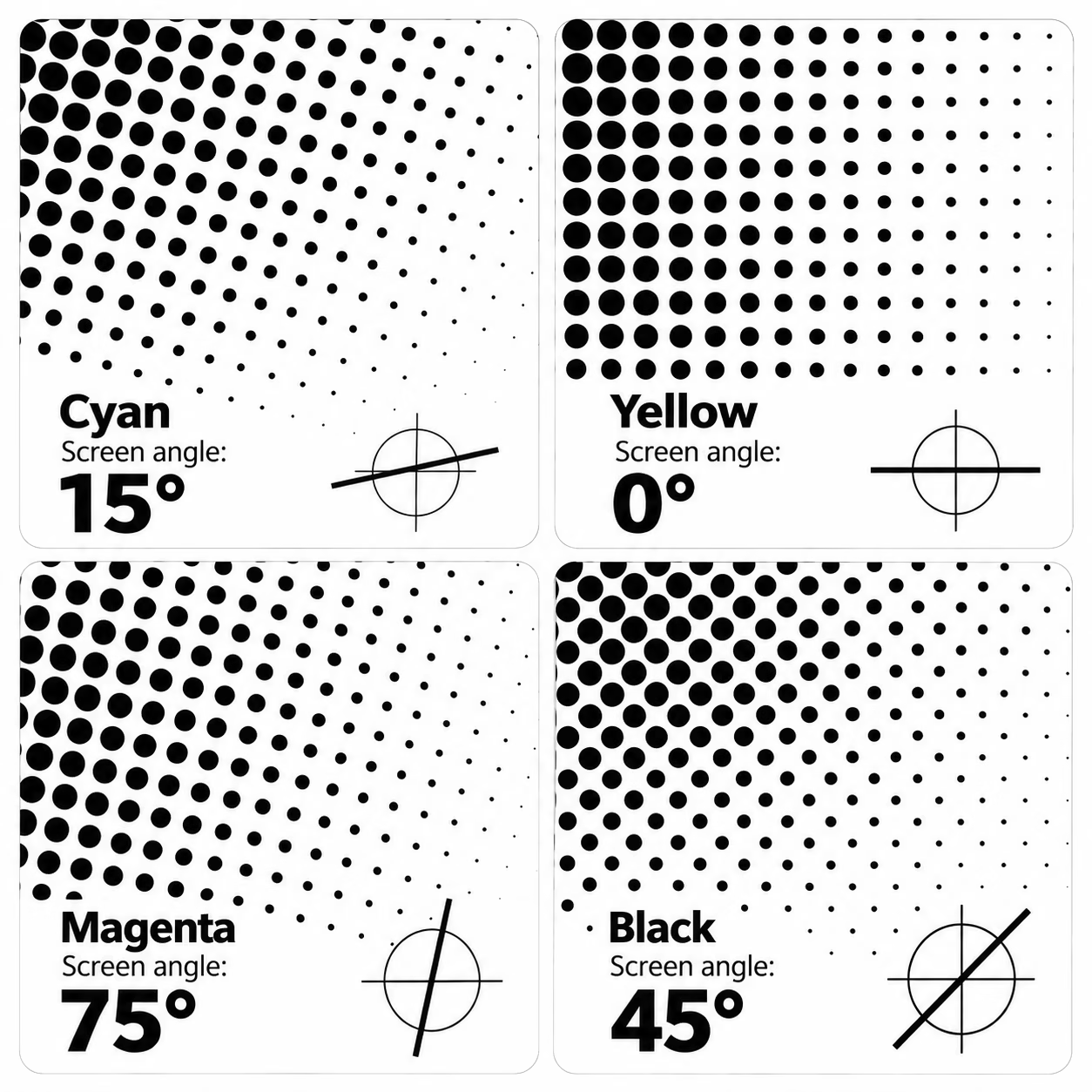
In commercial printing, each CMYK colour is reproduced using a pattern of tiny halftone dots. The dots vary in size to create different tones, from light tints to solid colour. Because cyan, magenta, yellow and black are printed in layers, each colour is assigned a different screen angle to reduce unwanted interference between the dot patterns. This helps prevent moiré patterns – distracting waves, ripples or geometric effects that can appear when screens overlap at unsuitable angles. Traditionally, cyan uses 15°, magenta 75°, yellow 0° (or 90°), and black 45°. These carefully chosen angles help produce smoother tonal transitions, cleaner detail and more consistent printed results. The exact angles can vary with the printing process and screening technology, but their purpose remains the same: to keep overlapping colour screens working together without creating unwanted visual patterns.
Why screen angles matter
- Preventing moiré: Each CMYK colour is printed using a pattern of tiny halftone dots. If these patterns overlap at unsuitable angles or frequencies, they can create unwanted interference patterns known as moiré, appearing as distracting waves, ripples or geometric shapes. Carefully chosen screen angles help minimise this effect.
- Why yellow uses a different angle: Yellow is the least visually prominent of the four process inks against a white background, so its dot pattern is less noticeable to the human eye. This allows yellow to be positioned at 0° (or 90°), close to the angles of other screens, without producing the same level of visible interference.
- Black contrast: Black traditionally uses a 45° screen angle because diagonal patterns are generally less visually conspicuous than horizontal or vertical ones. As black provides much of the image’s contrast and fine detail, this angle helps maintain a visually pleasing result, although it does not eliminate all edge irregularities.
- The rosette pattern: When the four halftone screens overlap, they produce a fine, repeating pattern known as a rosette. This is a normal characteristic of conventional CMYK printing and is a sign of how the separate colour screens combine to reproduce a continuous-tone image.
- Maintaining print quality: Correct screen angles help preserve smooth tonal transitions, detail and consistent colour reproduction. The precise angles may vary depending on the printing process and screening technology, but their purpose remains the same: to make the four colour screens work together with minimal unwanted interference.
Can CMYK screen angles be changed?
Yes. Although traditional CMYK printing uses established screen angles – Cyan 15°, Magenta 75°, Yellow 0° and Black 45° – these are not universal settings for every printing process. The yellow screen is often the most flexible because its lighter, less visually prominent dots make changes in angle less noticeable. A printer or prepress specialist may adjust the yellow angle to help minimise moiré or improve the rosette pattern, depending on the image, printing conditions and screening technology. Any changes should be made carefully, as unsuitable angles can introduce unwanted patterns or affect print quality.
Why can CMYK colours look different on screen?
One of the most common misunderstandings in print is expecting the colour shown on a monitor to exactly match the colour produced on paper. There are several reasons for this.
1. Screens produce light: Your monitor is effectively shining light towards your eyes. Printed paper relies on ambient light being reflected from its surface.
2. RGB usually has a wider gamut: Many modern screens can display colours that standard CMYK printing cannot reproduce.
3. Paper affects colour: The same CMYK values can look different when printed on coated, uncoated, recycled or coloured paper.
4. Printing processes differ: Offset lithographic printing and digital printing do not necessarily reproduce colour in exactly the same way.
5. Colour management matters: Monitor calibration, ICC profiles, PDF settings, printer profiles and conversion methods can all affect the final result.
For this reason, what you see on screen should not always be treated as an exact proof of the printed result.
CMYK in professional prepress
Good prepress is about much more than simply checking whether a file is labelled CMYK. A professional prepress workflow considers the complete journey from the original artwork to the finished printed piece. This can include checking:
- Colour mode
- ICC profiles
- Total ink coverage
- Rich black settings
- Overprinting
- Transparency
- Image resolution
- Bleed and trim
- Fonts
- PDF standards
- Spot colours
- Colour conversions
- The intended printing process and paper stock
For important work, a properly managed colour workflow helps reduce unexpected colour changes and gives the printer the best possible information from which to produce the job.
Is CMYK better than RGB?
Neither CMYK nor RGB is “better”. They are designed for different output environments. Use RGB when your artwork is intended for screens and digital display. Use CMYK when preparing artwork for a CMYK printing process, subject to the requirements of your printer and production workflow. The key is understanding where the artwork is going to end up.
A photograph intended for a website may be perfectly suited to RGB. The same photograph being reproduced in a printed brochure needs to be considered within the limitations of the chosen printing process.
Frequently Asked Questions about CMYK
What does CMYK stand for?
CMYK stands for Cyan, Magenta, Yellow and Key (Black). These are the four process colours traditionally used in full-colour printing.
What is CMYK used for?
CMYK is primarily used to reproduce full-colour artwork in print, including brochures, leaflets, magazines, packaging, posters, business cards and other printed materials.
Is CMYK better than RGB?
No. CMYK and RGB are designed for different purposes. RGB is used for digital displays, while CMYK is primarily used for printed output.
Can you print RGB?
A printing press cannot print RGB light values directly. RGB artwork must ultimately be interpreted or converted into the ink channels used by the particular printing process.
Why does CMYK look different from RGB?
RGB uses light to create colour and generally offers a larger colour gamut. CMYK uses physical inks, which means some colours displayed on screen cannot be reproduced accurately in standard CMYK printing.
What is K in CMYK?
K stands for Key, referring to the key printing plate traditionally used for black detail. K represents black ink. When you look at a black plate or print sheet it is surprising how little black ink is actually printed, most of the darker areas are created from the combination of the other three inks.
How many colours can CMYK produce?
CMYK can reproduce a very large range of colours through different combinations and percentages of its four inks. The exact printable gamut depends on the inks, paper, printing process and colour-management system.
Practical Range: Printers can produce thousands of visible tone combinations using overlapping dots, with expert estimates pointing to around 10 million theoretical shades depending on the device.
Theoretical Math: Digital files can code billions of combinations (256⁴), but physical ink cannot separate or hold that much detail on paper.
Human Spectrum: The four inks (Cyan, Magenta, Yellow, and Black) capture about 70% of the total spectrum humans can see. You can read more about how this works on the CMYK color model overview.
Why the number is limited
Subtractive Mixing: Inks act as filters that absorb specific parts of light and reflect the rest back to your eyes. Mixing all four at maximum levels creates a muddy black, but imperfect inks limit pure darks and deep tones.
Gamut Boundaries: Most ultra-bright neon colours plus vivid oranges and rich purples fall well outside the physical limits of standard process ink.
Surface Factors: Paper type, texture, and printer capability always change how much ink the page can hold. Every printing press in different.
Should photographs be CMYK or RGB for printing?
It depends on the printer and production workflow. Many professional workflows can accept RGB photographs and convert them using a controlled colour-management process. Always follow the printer’s artwork specifications for the particular job. See our FAQ for more information.
What is the difference between CMYK and Pantone?
CMYK creates colours using four process inks, whereas Pantone spot colours use specifically formulated inks to achieve a defined colour. Spot colours can be useful when precise brand colours or colours outside the normal CMYK gamut are required.
CMYK remains one of the foundations of commercial print. Understanding how it works – and how it differs from RGB – is essential for anyone creating artwork that will ultimately appear on paper.
Explore the world of PrePress