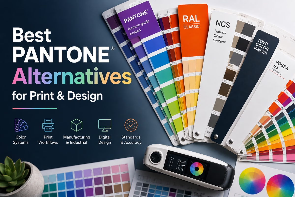
The best Pantone alternatives for print & design
Why designers are looking for Pantone alternatives
For decades, Pantone has been the global standard for specifying spot colours in commercial printing. Whether you’re producing business stationery, packaging, signage, or branded marketing materials, Pantone has traditionally been the first choice for achieving consistent, repeatable colours.
However, in recent years many designers and print professionals have looked for Pantone alternatives. Subscription costs, licensing changes, and the removal of built-in Pantone libraries from Adobe applications have encouraged businesses to explore other colour systems.
The good news is that Pantone isn’t your only option.
Do you actually need Pantone?
Before looking at Best Pantone Alternatives for Print & Design, ask yourself a simple question: Are spot colours necessary?
Many printed jobs today are produced on high-quality digital presses using CMYK process colours. Modern presses are capable of reproducing an impressive colour range without the need for additional spot inks.
If your logo or artwork doesn’t rely on a very bright orange, fluorescent green, metallic silver, or another colour outside the CMYK gamut, using CMYK may be perfectly adequate—and considerably more cost-effective.
Spot colours are generally only essential when:
- Brand consistency is critical.
- Colours fall outside the CMYK colour range.
- Metallic or fluorescent inks are required.
- Multiple print runs need to match as closely as possible.
- Printing on unusual materials or packaging.
FOGRA + LAB Workflows (Best for Commercial Printing)
Instead of relying on Pantone numbers, many printers now recommend:
- CIELAB (Lab) values
- ICC color profiles
- FOGRA standards
- ISO print specifications
Advantages
- Device-independent
- Excellent color accuracy
- Better for modern digital presses
- No proprietary subscription
Use FOGRA + Lab/ICC workflow if:
You do commercial printing
You produce packaging
You manage brand colours
You print across multiple substrates
You need predictable international reproductionThis has become increasingly common as digital printing continues to replace traditional spot-color jobs.
Freetone (Pantone Replacement)
Following Adobe’s removal of built-in Pantone libraries, designers created Freetone, an open color library intended as a free alternative for design work. While it’s useful during concept development, it is not an industry-recognised manufacturing standard, so it’s generally not appropriate when exact colour matching is contractually required.
Is FreeTone the same as Pantone?
Created by artist Stuart Semple, a strong advocate for making colour freely accessible, FreeTone was developed as an alternative to proprietary colour systems. The plug-in is available for free, and the accompanying swatch book costs just £35.
FreeTone uses the same colour numbers and values as Pantone (for example, Pantone 300 and FreeTone 300 are identical), making it compatible with the industry standard.
Website Culture Hustle
Freetone
https://culturehustle.com/products/freetone
HKS
One of Pantone’s closest competitors is HKS, particularly popular throughout Germany and parts of Europe. HKS is a spot colour system developed specifically for the printing industry and includes colour guides for coated and uncoated papers. Unlike Pantone, HKS was designed around European printing standards, making it a natural choice for many commercial printers.
Advantages:
- Excellent consistency.
- Strong support in European print shops.
- Guides for different paper stocks.
- Suitable for offset and many digital workflows.
Official website:
HKS Colours
https://www.hks-farben.de/en_us/
RAL
If your work involves paint, architecture, industrial coatings, signage, or manufacturing rather than commercial printing, RAL may be a better option.
RAL is widely used for:
- Powder coating
- Metal fabrication
- Paint manufacturing
- Building products
- Industrial equipment
Unlike Pantone, RAL colours are designed primarily for physical products rather than printed graphics.
Official website:
RAL Colours
https://www.ral-farben.de
NCS (Natural Colour System)
The Natural Colour System (NCS) is based on how humans perceive colour rather than on printing inks.
It is widely used by:
- Interior designers
- Architects
- Paint manufacturers
- Product designers
NCS provides a logical method of identifying colours using visual perception, making it particularly useful when selecting paint colours or specifying finishes.
Official website:
NCS Colour
https://ncscolour.com
Coloro
One of the newest professional colour systems is Coloro.
Rather than focusing solely on printed colour guides, Coloro combines physical colour standards with digital colour management tools. It has become increasingly popular within the fashion, textile, and product design industries.
Coloro provides:
- Physical colour libraries
- Digital colour data
- Manufacturing support
- Future colour trend forecasting
Official website:
Coloro
https://coloro.com
Toyo Color Finder (Best Pantone Alternative in Asia)
Toyo Color Finder is a professional colour-matching system developed in Japan, widely used in the graphic arts and printing industries, particularly across Asia. It provides a standardised range of spot colours that designers can reference when specifying and reproducing colours accurately in print.
Although primarily associated with the Japanese and Asian print markets, Toyo colours can also be useful to designers and printers worldwide. They offer an alternative reference system for selecting and communicating specific spot colours, particularly when working with international clients, suppliers or print production partners.
Popular in:
- Japan
- Parts of Asia
- Packaging printing
Advantages:
- Excellent offset printing support
- Recognized by many Asian print houses
- Included in some Adobe workflows where Pantone access changed
Explore the world
of PrePress

The Future of PrePress
Essential reading for the graphic and print industry.
Widows & orphans
How to avoid orphans and rives in typography
What resolution should a logo be?
We explain the rules in depth
Use CMYK Instead
Many designers automatically choose Pantone, (or any other guide) when it isn’t actually necessary. We have been doing this for 30 odd years and we can guarantee few people care or would spot the difference. Spot colours add £££’s to a print job.
If your work is printed digitally or lithographically using standard four-colour process printing, supplying accurate CMYK values is often enough.
Remember that some Pantone spot colours—particularly bright, fluorescent, and highly saturated colours—cannot be accurately reproduced using CMYK process printing. If colour accuracy is critical, consult your printer before converting
Additionally, colour appearance will vary between digital, lithographic (offset), and flexographic printing processes due to differences in inks, substrates, and press characteristics. It is always recommended to carry out colour proofs and consult your printer to ensure the best possible match.
Use LAB values
In real-world graphic design, LAB colour is used much less often than RGB or CMYK, but there are a few professional situations where it is genuinely useful. Most designers will not pick LAB as their everyday working colour space; they use it when they need more accurate colour control. If you’re developing a brand identity, consider storing colours as CIELAB (LAB) values rather than relying solely on Pantone references.
LAB is device-independent, making it useful for converting colours between:
- CMYK
- RGB
- HEX
- Spot colour systems
Many colour management systems use LAB as the reference colour space because it represents colour more consistently across different devices.

Helpful colour conversion tools
Although there is no perfect automatic conversion between proprietary colour systems, these tools can help you find close matches:
Coloro
https://coloro.com
Shademix
https://shademix.com
Keep in mind that any online converter provides an approximation. Final colour selection should always be confirmed using physical colour guides or printed proofs.
Can you convert Pantone to other systems?
Yes – but with limitations. Pantone colours can usually be converted to approximate CMYK, RGB, HEX, LAB, HKS, or RAL equivalents. However, no conversion is exact because each colour system has its own colour gamut, formulation, and intended application.
Pantone itself notes that it does not provide cross-reference guides to other proprietary colour systems such as RAL, HKS, or NCS, due to trademark and licensing restrictions.
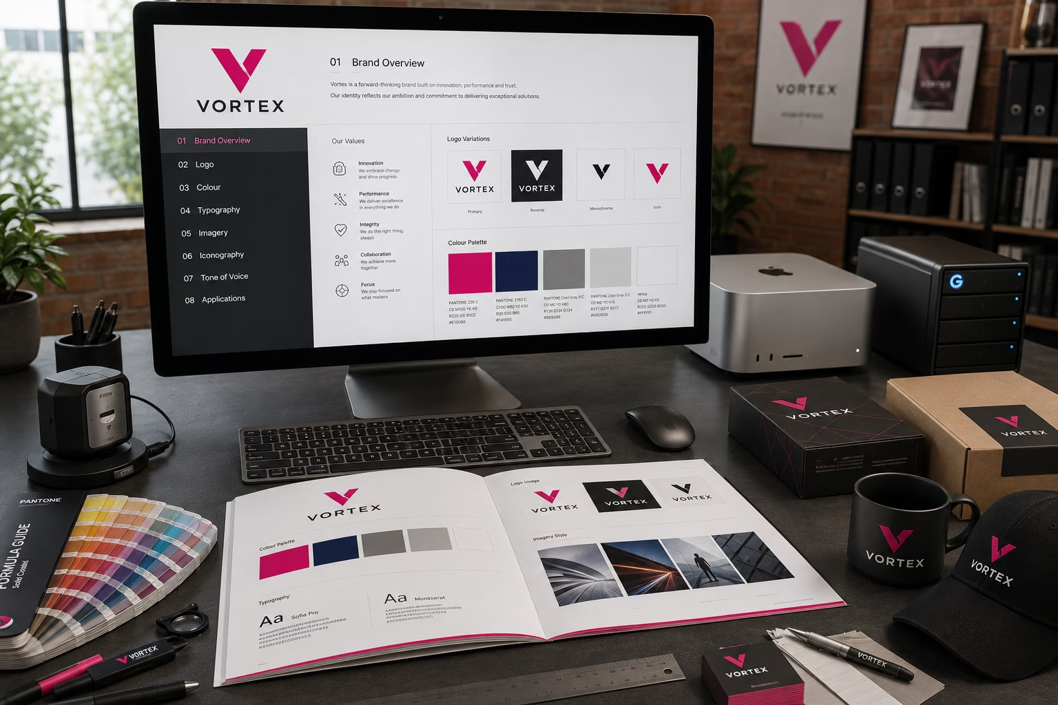
Many of the Pantone colour convert with no problems, Pantone even provide a conversion book clearly showing the difference between Pantone and CMYK colour values. If as a professional designer you choose to design a logo and not consider the CMYK, RAL and Pantone colours you really should not be doing this job. Always ensure that brand guidelines specify the breakdowns of each.
Which system should you choose?
The best colour system depends entirely on your industry.
| Industry | Recommended |
|---|---|
| Commercial Printing | CMYK, FreeTone or HKS |
| Digital Printing | CMYK |
| Branding | LAB + CMYK + RGB + HEX + RAL |
| Paintings & Coatings | RAL or NCS |
| Fashion & Textiles | Coloro |
| Manufacturing | RAL |
| Exhibition | CMYK and RAL |
| Packaging | CMYK, Pantone or HKS |
Final thoughts
Pantone remains an excellent colour system and is still the most widely recognised standard in commercial printing if you are prepared to pay for it. However, it is no longer the only professional choice. There many Pantone Alternatives.
For many print jobs, accurate CMYK values and proper colour management are all that’s required. If you work in manufacturing, architecture, or product design, systems such as HKS, RAL, NCS, or Coloro may be better suited to your needs.
Whatever system you use, remember that no colour specification replaces a physical proof. If colour accuracy is important, always check a printed sample before approving the final production run.