Brand Design
Outstanding and original brand design for businesses
Brand design is far more than creating a logo. It is the visual expression of a business – bringing together strategy, typography, colour, imagery, graphic style and consistency to create a recognisable and memorable identity.
A strong brand design helps a business communicate who it is, what it stands for and what makes it different. It should work wherever the brand appears, from a website and social media to brochures, packaging, advertising, exhibitions and printed literature.
At PrePress, we believe good brand design should be distinctive, practical and built to last.
What is brand design?
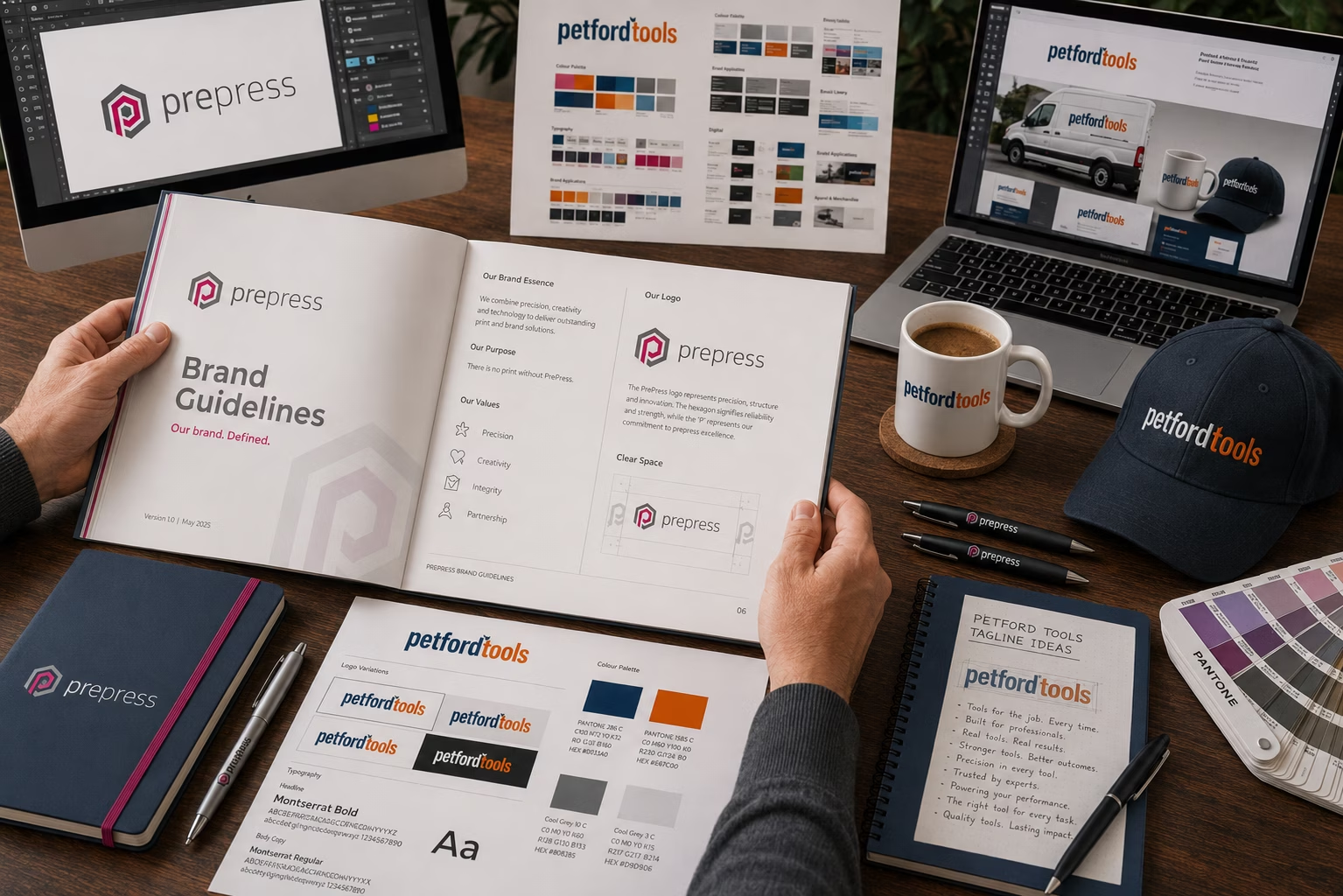
Brand design is the process of creating the visual identity of a business, organisation or product. It includes much more than the logo. A successful identity brings a number of visual elements together so they work as one consistent system. These can include but not limited to:
- Logo and supporting graphics
- Colour palettes
- Typography and font selection
- Photography and image style
- Illustration and iconography
- Layout and composition
- Graphic devices and visual elements
- Packaging and product presentation
- Website and digital graphics
- Advertising and marketing materials
- Printed literature
- Exhibition and display graphics
The individual elements are important, but it is the way they work together that creates a recognisable brand.
Every business is different so effective brand design shouldn’t come from a formula. Over the years we’ve created identities for businesses across a wide range of industries, from new ventures requiring a complete identity to established companies looking to refresh an existing brand.
Brand design is more than a logo
A logo is an important part of a brand, but it isn’t the brand itself. A logo provides recognition. Brand design creates the visual language that surrounds it. Think of the logo as the signature of a business. The typography, colours, imagery, layouts and graphic style are the handwriting that makes everything else recognisable as belonging to the same organisation.
This is why simply changing a logo rarely creates a completely new brand. Effective brand design considers the whole visual identity and how it will be used.
What makes good brand design?
Good brand design should be distinctive enough to be recognised, flexible enough to work across different applications and appropriate for the business it represents.
Recognition
A successful brand becomes recognisable through consistent visual communication. Customers should be able to identify a business through its colours, typography, imagery and graphic style, sometimes before they even see its name.
Consistency
A brand needs to work everywhere it appears. A website, brochure, business card, advertisement, social media graphic, package or exhibition stand may all have different requirements, but they should still feel like the same brand.
Differentiation
Good brand design helps a business stand apart from its competitors. It should communicate what makes the organisation different rather than simply following whatever visual style happens to be fashionable.
Trust
Professional and consistent presentation can make a significant difference to how a business is perceived. A considered visual identity helps create confidence and gives customers a reason to take the business seriously.
Flexibility
Modern brands appear across an enormous range of formats and sizes. A successful identity needs to work on a mobile screen just as effectively as it does on a large-format exhibition graphic or printed brochure.
Longevity
Trends come and go. Good brand design shouldn’t need completely reinventing every few years simply because the latest visual fashion has changed. The best identities are designed with enough character to remain relevant while allowing them to evolve when necessary.
What does a brand identity include?
A complete brand identity is much more than a logo and a set of colours. It is a collection of visual, verbal and sometimes physical elements that work together to make a business recognisable.
Some elements are obvious, such as the logo and colour palette. Others are less noticeable but can be just as important — including the way a business writes, the type of photography it uses, the sounds associated with it, the materials it chooses and even the way information is arranged on a page.
The most effective identities are not simply collections of individual design elements. They are systems in which those elements work together.
Logo design
The logo is often the most recognisable part of a brand identity, but it is only one part of the system. A good logo needs to work at very different sizes and in very different situations — from a website header or social media profile to a vehicle, packaging, signage or a large exhibition graphic. It may also need different versions for different applications, such as a horizontal logo, stacked version, symbol or simplified mark.
A useful test is to ask whether the logo still works when it is removed from the presentation it was originally designed for. A logo that looks impressive at 2,000 pixels wide but becomes unreadable at 20mm is not particularly practical.
Colour
Colour is one of the most powerful recognition tools available to a brand. People can sometimes recognise a brand from its colours before they have consciously noticed its logo.
A brand colour is also more complicated than choosing a colour from a screen. A professional identity should define how colours are reproduced in different environments — typically using CMYK for print, RGB and HEX for digital applications, and sometimes Pantone or another spot-colour reference where particularly accurate reproduction is required.
There is another important consideration: the same colour does not necessarily look the same everywhere. Paper, ink, printing process, screen technology and viewing conditions can all affect the result. This is why simply specifying a HEX value is not enough for a brand that is going to appear in both print and digital media.
A strong colour system therefore defines not only the colours themselves, but also how they are used — for example, which is the primary brand colour, which colours are supporting colours and where accent colours should be introduced.
Typography
Typography is one of the quieter parts of a brand identity, but it can have an enormous effect on how a business feels. The choice of typeface, weight, size, spacing and hierarchy can make the same words appear authoritative, technical, traditional, friendly, luxurious or contemporary.
A good identity therefore needs more than simply naming a font. It should establish how typography works as a system. That might include a typeface for headlines, another for body text, rules for hierarchy, recommended weights, line spacing and how typography should be used in different applications.
There is also a practical consideration that is often missed: a typeface has to survive outside the designer’s computer. Font licensing, website performance, availability across operating systems and whether the typeface works in office documents, presentations and third-party software can all affect the practicality of a brand.
The best typeface is therefore not necessarily the most fashionable one. It is the one that expresses the character of the brand and can be used consistently in the real world.
Photography and imagery
Photography can become a recognisable part of a brand in its own right. Two businesses could use exactly the same logo and colour palette but feel completely different because one uses carefully lit, highly polished photography while the other uses informal documentary-style images.
Brand guidelines can therefore define the character of photography — including subjects, lighting, composition, cropping, colour treatment and even the emotions or situations the images should convey. The objective is not necessarily to make every photograph look identical. It is to make the images feel as though they belong to the same brand.
Illustration and iconography
Illustrations, icons and symbols can provide another layer of recognition, particularly for businesses that need to explain complex information or communicate across digital platforms.
A consistent approach to line weight, shape, proportion, colour and level of detail can make a collection of icons or illustrations feel like part of one visual system rather than a mixture of graphics obtained from different sources.
Graphic style
Graphic elements can give a brand a visual language beyond its logo. These might include shapes, lines, patterns, borders, frames, graphic devices, distinctive image treatments or recurring visual motifs. They can be particularly useful when a business needs to produce a large amount of communication without placing the logo on everything.
This is one of the ways a mature identity becomes recognisable. The logo doesn’t have to appear on every piece of communication if the other visual cues are strong enough.
Layout and composition
The way information is arranged is also part of brand identity. Margins, grids, spacing, image proportions, headline placement and the relationship between text and imagery can create a consistent visual rhythm across brochures, websites, advertising and social media.
This does not mean every page has to look the same. A good layout system provides enough structure to create consistency while leaving designers enough freedom to produce something appropriate for each application.
Tone of voice
A brand does not only have a visual personality. It has a verbal personality too. Tone of voice defines how a business sounds when it communicates. Is it authoritative, straightforward, reassuring, conversational, technical, energetic or perhaps deliberately understated?
This affects much more than advertising copy. It can influence website content, social media posts, emails, brochures, product descriptions, customer service messages and even the words used on packaging.
A useful way to think about tone of voice is that if the logo is how the brand is recognised visually, tone of voice is how the brand is recognised when it speaks. The important point is consistency. A business that presents itself as relaxed and approachable visually but communicates in stiff, formal language can create a confusing experience.
Sound and sonic identity
Sound is becoming increasingly relevant as brands appear in video, social media, podcasts, presentations, apps and digital advertising. A sonic identity can include a short audio signature, a particular style of music, sounds associated with a product or a consistent approach to voice and audio.
Not every business needs one. For many smaller companies it would be unnecessary. But where customers regularly encounter a brand through video or audio, sound can become another recognition cue — just as colour and typography work visually. This is particularly interesting because a brand can now be experienced through sight, sound and movement rather than simply through a printed page or website.
Motion and animation
Digital communication has also introduced movement as part of brand identity. The way a logo appears, how a page transitions, how graphics move or how information is animated can all contribute to the character of a brand.
A technology company might use precise, controlled movement, while an entertainment brand may use something much more expressive. The important thing is that motion should feel like an extension of the brand rather than decoration added afterwards.
Texture and materials
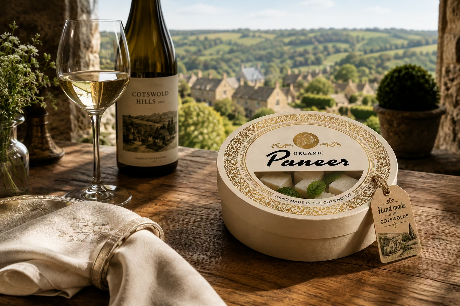
Texture is often forgotten because so much brand design is now viewed on a screen. In the physical world, however, materials can communicate something about a business before a customer has read a single word. Paper stock, packaging materials, embossing, foiling, varnishes, fabrics and other finishes can all influence how a brand feels.
A premium business might deliberately use substantial paper and refined finishes. A natural or environmentally focused brand might use uncoated, recycled or tactile materials. An industrial brand might use very different physical characteristics.
This means that the physical materials used by a brand can become part of the identity itself, particularly in packaging, stationery, printed literature, signage and exhibitions.
Brand guidelines
All of these elements need somewhere to be defined.
Brand guidelines – sometimes called brand standards or a brand book — explain how the identity should be used. They can cover everything from logo proportions and colour specifications to typography, photography, tone of voice, graphic elements, digital applications and print production.
The purpose is not to create hundreds of rules. It is to make sure that everyone using the brand understands the important principles and can reproduce them consistently.
A good brand identity should therefore be thought of as a system rather than a collection of files.
The logo is one component. Colour, typography, imagery, language, layout, movement, sound and physical materials can all contribute to recognition. When these elements work together, a business develops something much more powerful than a logo — it develops a distinctive identity that people can recognise wherever they encounter it.
Brand design and graphic design
Brand design and graphic design are closely related, but they are not exactly the same thing. Brand design establishes the visual identity. Graphic design applies that identity to individual pieces of communication.
For example, a brand identity may establish the logo, colours, typography and visual style. A graphic designer then uses those elements to create a brochure, advertisement, exhibition panel, presentation or social media campaign. Good graphic design therefore depends on understanding the brand it is communicating.
Brand design for print and digital
A brand needs to work across both digital and physical media. On screen, a brand may appear on a website, social media, email campaign or mobile device. In print, the same identity might appear on stationery, brochures, packaging, signage, exhibition graphics or promotional literature.
This is where technical knowledge becomes important. Colours can behave differently on screen and in print. Images require appropriate resolution. Logos need to be supplied in suitable formats. Typography needs to work across different applications.
A brand may look excellent on screen but fail when it is reproduced physically if these considerations haven’t been taken into account. Good brand design therefore considers how an identity will actually be used, not simply how it looks in a presentation.
Creating a strong brand
Creating a successful brand starts with understanding the business behind it. What does the company stand for? Who does it want to reach? What makes it different? What should customers think and feel when they encounter it? These questions help establish the direction for the visual identity.
The design process can then bring those ideas together through logo design, typography, colour, imagery, graphic style and layout. The result shouldn’t simply be a new logo. It should be a visual system that can be applied consistently across every place the business communicates.
Brand design in practice
Every business is different, so effective brand design shouldn’t come from a standard formula. Over the years, PrePress has created identities and visual communications for businesses and organisations across a wide range of sectors. Some have required a completely new identity; others have needed an existing brand developed, refreshed or brought up to date.
The objective is always the same: to create a distinctive visual identity that works in the real world. That means considering not only how the brand looks, but how it will be reproduced, adapted and used across different media.
Why professional brand design matters
Your brand is often the first impression people have of your business. Before someone reads your sales message, talks to your team or uses your product, they may already have formed an opinion based on what they see. A well-designed identity can communicate professionalism, confidence and credibility. More importantly, consistent use of that identity helps build recognition over time. Brand design is therefore an investment in how a business is seen, remembered and understood.
Brand & design knowledge base
We’ve created a growing collection of practical information covering brand design, graphic design, colour, typography, logos, artwork and preparing creative work for print and digital use. Explore the Brand & Design Knowledge Base for straightforward explanations and practical advice from people with decades of experience in design, reprographics and print production.
Brand design from PrePress
PrePress brings together graphic design, reprographics, prepress and print knowledge developed over more than three decades. That combination matters because a brand doesn’t exist only on a screen. It has to work wherever your business communicates. From the original concept through to artwork, reproduction and finished communication, good brand design considers the complete journey.
A strong brand is more than a logo. It is a consistent visual identity that helps your business become recognised, remembered and trusted.
What should be in a brand book?
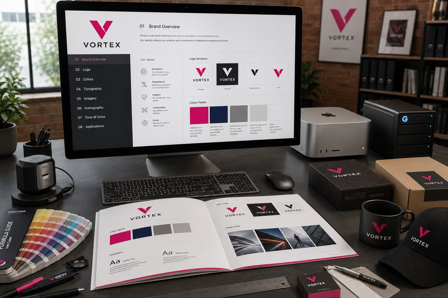
A brand book, often called brand guidelines or brand standards, explains how an identity should be used.
Its purpose is simple: to make sure the brand looks, sounds and behaves consistently wherever it appears.
The size of the document should reflect the size and complexity of the brand. There is little value in giving a small business a 100-page set of guidelines that nobody needs or uses. Equally, a large organisation may need extensive rules to ensure consistency across multiple departments, suppliers, agencies and countries.
A brand book for a small business
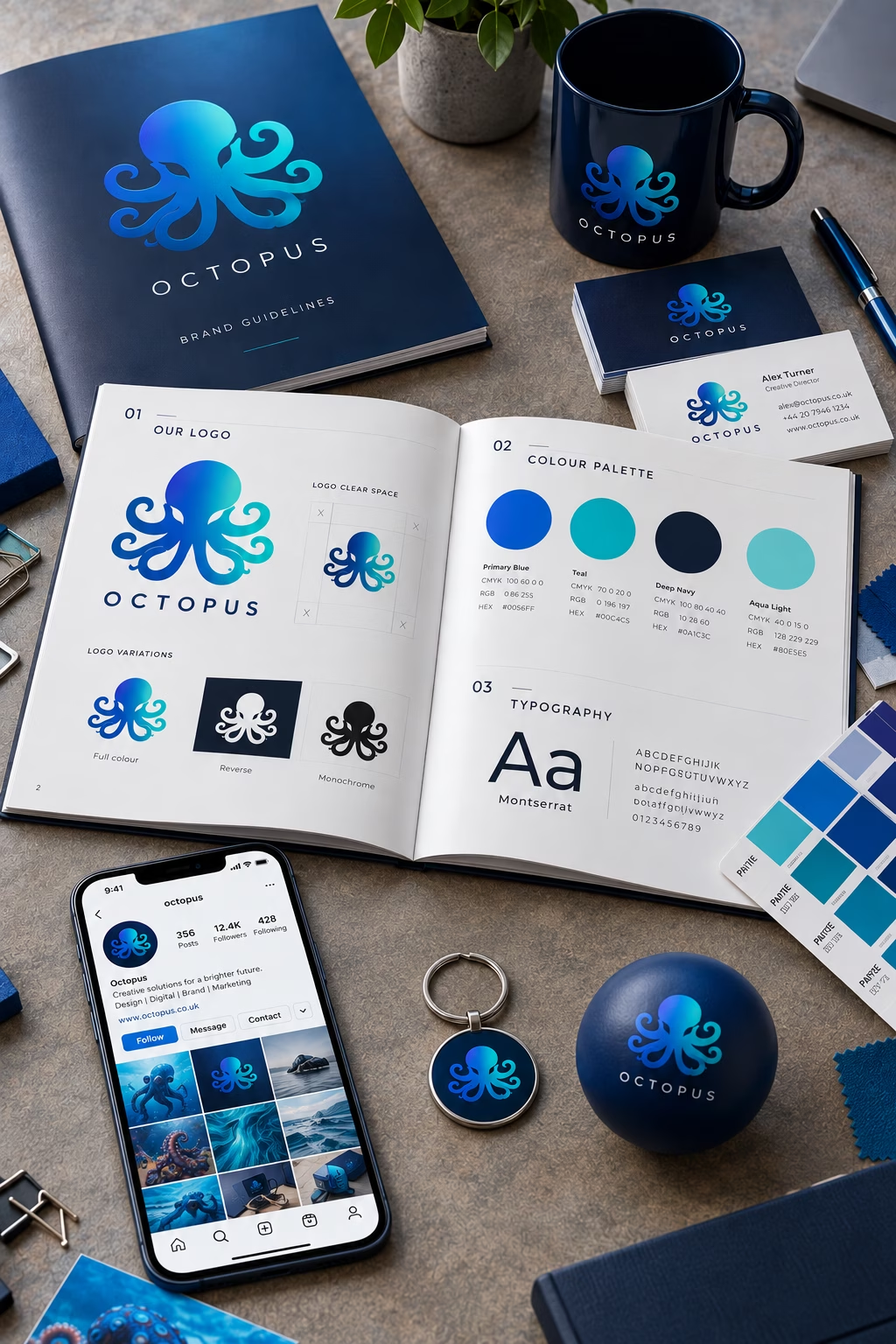
For a smaller business, a practical brand book might include:
- Brand overview and positioning
- Logo and logo variations
- Clear space and minimum size
- Incorrect logo usage
- Primary and secondary colours
- CMYK, RGB and HEX colour specifications
- Typography and font hierarchy
- Photography style
- Graphic elements and iconography
- Basic layout principles
- Tone of voice
- Examples of the identity in use
The objective is not to create unnecessary rules. It is to give everyone working with the brand enough information to reproduce it correctly and consistently.
A brand book for a larger organisation
Larger organisations usually require much more comprehensive guidelines. These may include:
- Brand strategy and positioning
- Brand architecture and sub-brands
- Naming conventions
- Logo systems and detailed usage rules
- Colour systems and reproduction specifications
- Typography
- Photography
- Illustration
- Iconography
- Grids and layout systems
- Tone of voice and editorial style
- Messaging hierarchy
- Digital applications
- Social media
- Motion and animation
- Sonic identity
- Packaging
- Signage and vehicles
- Exhibitions and environments
- Advertising
- Internal communications
- Templates and downloadable assets
- Accessibility requirements
- Print production specifications
A word of warning
Whilst brand books are considered essential, particularly for defining colour, typography and tone of voice, we have seen brand books running to hundreds of pages, containing numerous sections, alternatives, rules, do’s and don’ts.
The problem is that more detail does not necessarily create better brand consistency. In practice, much of that detail may never be referred to. When a deadline is approaching, nobody wants to spend time checking the precise angle of a gradient or whether the spacing between images is exactly the same on two axes. If the guidelines become too complicated, they can simply be ignored.
This becomes even more apparent in larger organisations, where multiple departments and individuals may be responsible for producing communications. Many of them will not be marketing specialists or have day-to-day responsibility for managing the brand. If the guidelines are too long or complicated, they are unlikely to be consulted when they are actually needed.
The purpose of a brand book is to create consistency and clarity, not to create a rule book for every possible situation.
Our experience is that a brand book works better when it concentrates on the things that genuinely matter: how the brand looks, how it communicates and how it should be used across the most important applications.
There is another consideration too. Brands change. Businesses evolve, audiences change and the way we communicate changes. A brand book that was created ten years ago may contain rules that no longer make sense today.
A good brand book should therefore be practical, relevant and easy to use. Keep the important things clear, leave room for professional judgement, and review the guidelines as the brand develops.
Explore the world of PrePress


For more information about our brand design services please use the form below.