Widows Orphans and Rivers
Common typography problems in print
Widows, orphans and rivers are small typographic details that can make a big difference to the appearance and readability of a printed page. Here’s what they are, why they happen and how professional designers and prepress operators deal with them.
Good typography is about much more than choosing a typeface. The size of the text, line length, leading, spacing, hyphenation and positioning of paragraphs all affect how a page looks and reads. When these elements aren’t properly controlled, you can end up with typographic problems that may be easy to overlook on screen but become surprisingly obvious in a finished brochure, magazine, book or report.
Three of the most common are widows, orphans and rivers. They are not normally printing errors. They are problems with typography, typesetting and page composition.
What is a widow?
In typography, a widow is generally a short line of text — often a single word or a very short phrase — left at the end of a paragraph, particularly when it appears on its own at the top or bottom of a page or column.
The exact definition of a widow varies between typographic traditions. Some publishers use the term specifically for a short final line at the top of a new page or column, while others use it more generally for a short final line. The important point is simple: a paragraph should ideally finish in a way that looks balanced and intentional.
Widows and orphans often get mixed up and swopped around, there is a simple mnemonic: A widow is “alone at the top”
Widows, orphans and rivers on digital screens
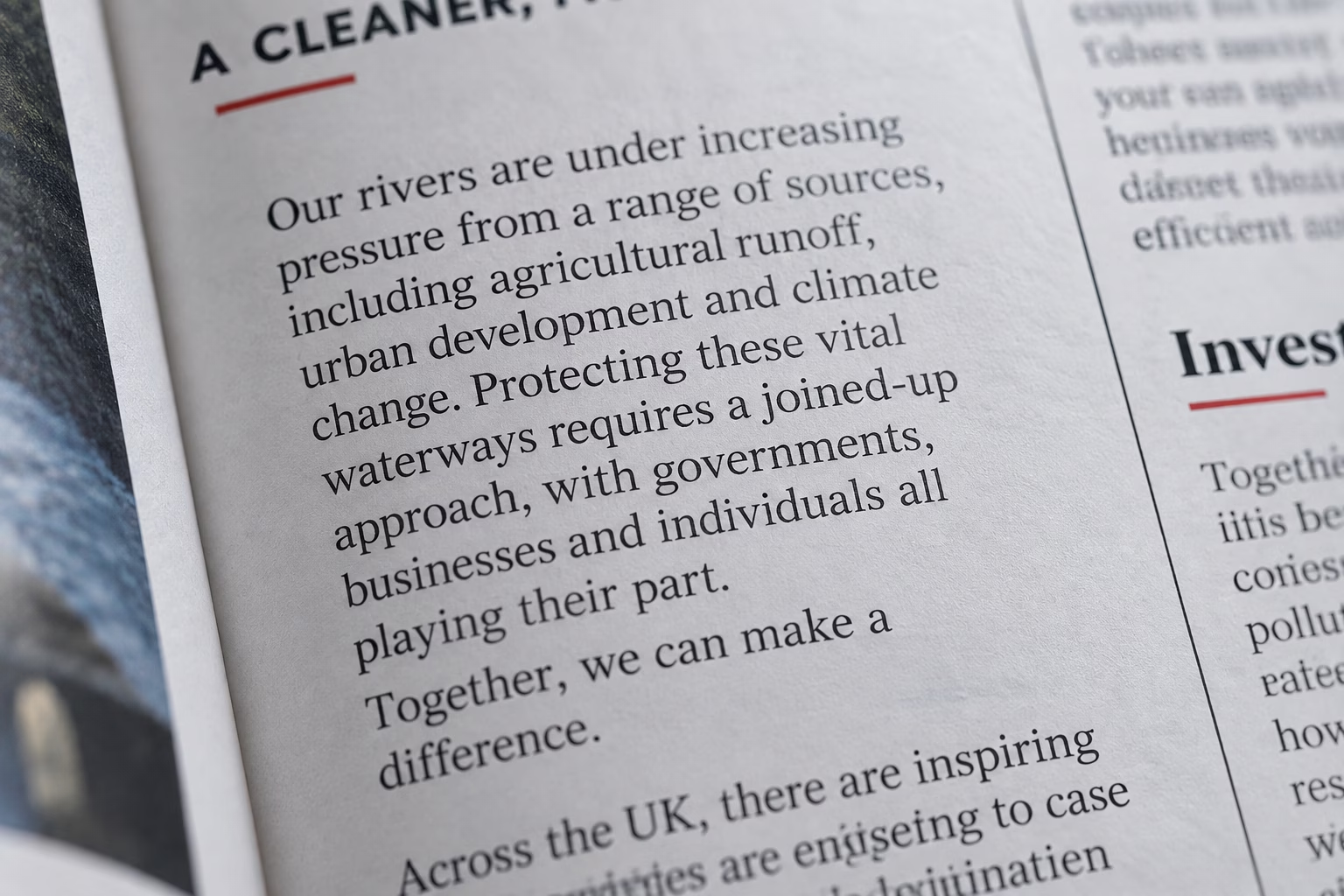
Widows, orphans and rivers aren’t confined to printed pages. They can occur on websites, digital publications, PDFs and other screen-based media whenever text is allowed to reflow.
The principles of good typography remain the same, but digital typography presents an additional challenge: you don’t know exactly how the reader will view the text.
A paragraph that looks perfectly balanced on a desktop screen may produce a short final line when viewed on a tablet or mobile phone. Changes in screen width, font size, browser settings and responsive layouts can all alter where the words fall.
This means that, unlike traditional typesetting, you cannot always manually adjust every line to achieve a perfect result.
How to avoid them on digital screens
Good web typography starts with the fundamentals:
- Use an appropriate line length. Very wide paragraphs can create awkward line endings and make text harder to read.
- Choose a suitable type size and line spacing. Comfortable typography helps paragraphs flow naturally.
- Use responsive layouts. Text should reflow naturally rather than being forced into a fixed width.
- Avoid unnecessary manual line breaks. A line break that looks right on a desktop can create an obvious problem on a mobile screen.
- Use modern CSS typography controls where appropriate. Properties such as
text-wrap: prettycan improve paragraph wrapping, whiletext-wrap: balancecan produce better-balanced headings. - Check the finished page at different screen sizes. Always review typography on desktop, tablet and mobile.
The objective isn’t necessarily to make every line identical or to eliminate every short final line. It is to ensure that the typography remains comfortable, balanced and easy to read whatever device the reader uses.
Good typography is about controlling what you can — and designing intelligently for what you can’t.
What is an orphan?
An orphan is generally a line or small part of a paragraph that becomes separated from the rest of the paragraph, particularly when it appears at the bottom of a page or column. For example, a paragraph may begin at the bottom of a page with only one line before continuing onto the following page.
This can leave the reader with very little context before the page break and makes the page composition look untidy. As with widows, terminology varies. Some typographers use orphan for the first line of a paragraph left at the bottom of a page, while others use the terms the other way around.
What are rivers in typography?
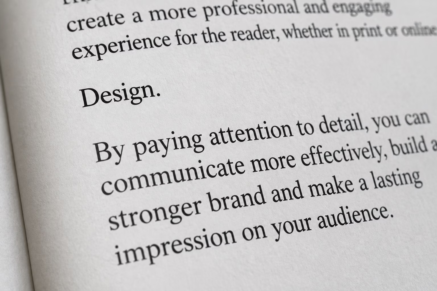
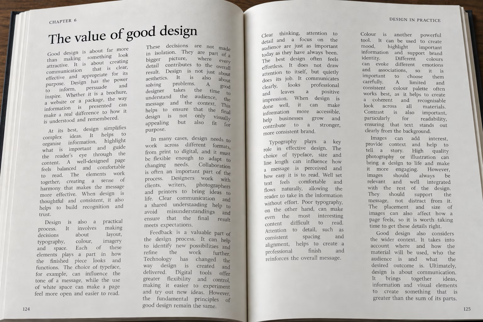
Rivers are different from widows and orphans. A river is a distracting channel of white space that appears to run vertically or diagonally through a block of text. They are most commonly associated with fully justified text.
When text is justified, the software adjusts the spacing between words so that the text aligns with both the left and right edges of the text frame. Depending on the words and line lengths, larger spaces can sometimes occur between words. If similar spaces happen to line up over several lines, they can create the appearance of a white “river” running through the paragraph. Rivers can be particularly noticeable in:
- Books
- Magazines
- Newspapers
- Brochures
- Annual reports
- Catalogues
- Corporate literature
They interrupt the visual texture of the page and can make text more difficult to read.
Why do rivers happen?
Rivers are largely a consequence of word spacing and line length. A narrow column containing justified text is more likely to produce uneven spacing because there are fewer words available to distribute across each line. The typeface also makes a difference. Some fonts naturally produce more consistent word spacing than others, while unusual combinations of short and long words can make the problem worse. Hyphenation can sometimes help by giving the typesetting software more options for creating balanced lines. However, simply switching on automatic hyphenation isn’t always the answer. Poorly controlled hyphenation can introduce its own problems.
How are widows, orphans and rivers fixed?
There isn’t one universal solution. Professional typesetting is often about making small adjustments that improve the overall page without creating another problem somewhere else. Depending on the situation, a designer or prepress operator might:
Adjust the line breaks
Changing where a line ends can remove a widow or reduce an obvious river.
Adjust the text frame
Making a text column slightly wider or narrower can completely change the way paragraphs flow.
Adjust leading
A small change to the space between lines can sometimes bring a paragraph together or move a line onto the next page.
Adjust tracking
Very small adjustments to the spacing between characters can occasionally improve a paragraph’s appearance.This should be done carefully. Excessive tracking can make typography look obviously manipulated.
Use hyphenation
Controlled hyphenation can produce more evenly spaced justified text and reduce the likelihood of rivers.
Rewrite or edit the copy
Sometimes the best solution is simply to change a few words. Removing a word, adding a word or making a small editorial change can completely alter the way a paragraph breaks.
Change the page composition
If a paragraph simply refuses to behave, the answer may be to adjust the surrounding design rather than forcing the text to fit.
Range left or right
This may be the quickest solution but only if with brand or editorial agreement. Not always guaranteed to work without extra effort in adjusting the text.
Why do these details matter in professional print?
A reader may never consciously think: “That page has a widow.” But they may still sense that something doesn’t look quite right. Professional typography creates a consistent visual rhythm across a page. Paragraphs should sit comfortably within the layout, with appropriate spacing and line lengths. This becomes particularly important in publications containing large amounts of text.
A brochure, magazine or annual report may contain hundreds of paragraphs. Small typographic problems repeated throughout a publication can have a significant effect on its overall appearance. And unlike a spelling mistake, they are often something that software won’t necessarily tell you is wrong.
Can InDesign fix widows and orphans automatically?
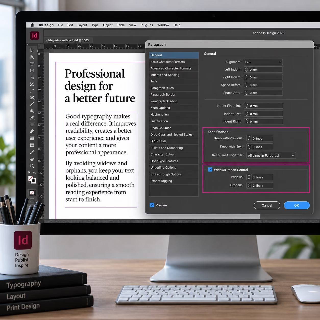
Adobe InDesign includes controls that can help prevent undesirable paragraph breaks, including Keep Options and settings for controlling how many lines of a paragraph should remain together.
These tools are extremely useful, but they shouldn’t replace visual checking. Automatic controls can solve one problem while creating another — for example, producing an unusually large gap elsewhere on the page. Good typesetting is therefore a combination of software controls and human judgement.
Are widows, orphans and rivers printing errors?
No. They are generally typographic and layout problems rather than printing defects. A printing press or digital printer will faithfully reproduce the artwork it receives. If the artwork contains a badly broken paragraph or a visible river, the printer is likely to reproduce it exactly as supplied.This is why the quality of the artwork and the prepress checking process matter so much.
The difference between good typography and simply making text fit
One of the easiest mistakes in page design is to treat typography as something that simply needs to fit into the available space. A Professional typesetter works differently.
The objective isn’t just to get all the words onto the page. It is to create a page where the type, images, headings, white space and overall composition work together. Sometimes the difference between an ordinary page and an excellent one is only a few small adjustments to the typography. Expertise leads to speed, so if you are starting out care is the word.
Frequently asked questions
What is a widow in typography?
A widow is generally a short final line of a paragraph that is visually separated from the rest of the paragraph, particularly when it occurs at the top or bottom of a page or column.
What is an orphan in typography?
An orphan generally refers to a line or small part of a paragraph that is separated from the main body of the paragraph by a page or column break.
What is a river in typography?
A river is a distracting vertical or diagonal channel of white space created when spaces between words in justified text appear to line up across several lines.
Are widows and orphans the same thing?
No. They describe different types of awkward paragraph breaks, although the terminology is used inconsistently by different typographers and publishing systems.
Are rivers caused by the printer?
No. Rivers are created by the typography and page layout. The printing process normally reproduces the artwork as supplied.
Can InDesign prevent widows and orphans?
Yes. InDesign provides paragraph and Keep Options controls that can help control unwanted paragraph breaks. However, the finished page should still be checked visually.
Professional typography is in the detail
Widows, orphans and rivers may seem like minor details, but they are exactly the sort of details that separate professional page make-up from simply putting text into a layout. Same applies to typesetting. Traditional typesetting sizes are used today because they ensure optimal readability, maintain professional design standards, and honor a centuries-old craft.
Good typography should look effortless. The reader shouldn’t notice the work that has gone into it – they should simply find the page comfortable to read and visually well balanced. That is the job of good typography.
Explore the world
of PrePress



What resolution should a logo be?
We explain the rules in depth
Explore the world of PrePress