Print vs screen colours
Why don’t my printed colours match my screen?
A complete guide to print vs screen colours. RGB, CMYK and colour accuracy
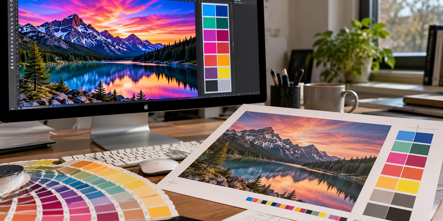
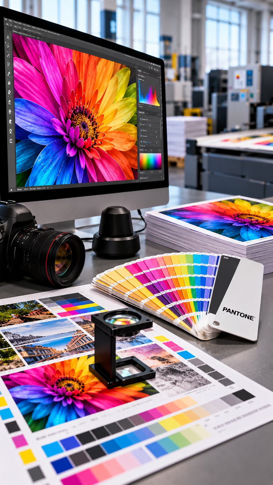
Why do colours look different in print? If the colours on your monitor don’t match the finished printed piece, you’re not necessarily doing anything wrong. Screens and printing presses reproduce colour in fundamentally different ways, and several factors can affect the final result.
If you’ve ever spent hours perfecting a design only to receive the printed version and discover the colours look darker, duller or simply different, you’re not alone. The good news is that this doesn’t usually indicate a printing error. In most cases, it’s the result of the fundamental differences between how digital screens display colour and how commercial printing reproduces it on paper.
Understanding the differences in print vs screen colours is at the heart of professional prepress, colour management and print production. Once you know why colours change, you’ll be able to prepare artwork that delivers far more predictable results.
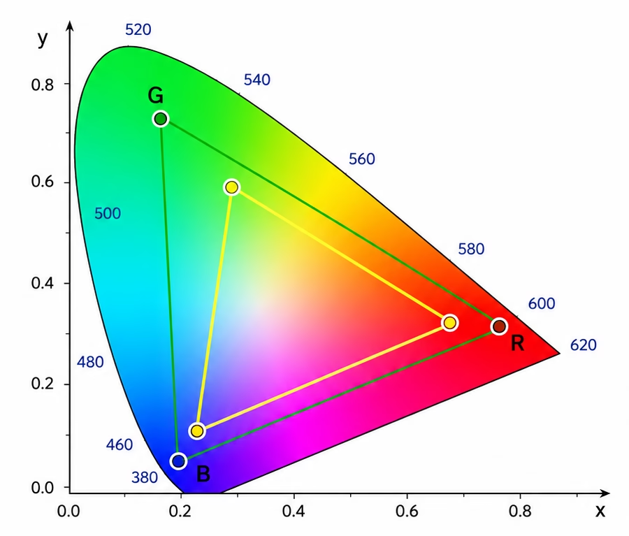
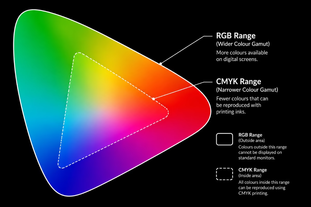
Above: Shows the perceived visual range, followed by the RGB and then the smaller CMYK. You can understand if you choose a colour outside the CMYK range it will not print as expected.
Why printed colours look different from screen colours.
The biggest reason is simple: Screens produce colour using light. Printed materials reproduce colour using ink. Your monitor creates colour by emitting red, green and blue light directly into your eyes. A printed sheet of paper has no light source of its own—it simply reflects the available light in the room.
Because these are two completely different technologies, they cannot reproduce every colour in exactly the same way. Even under ideal conditions, some colour variation should always be expected.
RGB vs CMYK – Two different colour systems
RGB (Red, Green and Blue)
RGB is used for:
- websites
- social media
- mobile phones
- televisions
- computer monitors
- digital photography
Every colour is created by mixing different intensities of red, green and blue light. Because RGB is light-based, it can reproduce an exceptionally wide range of bright, vivid colours.
CMYK (Cyan, Magenta, Yellow and Black)
Commercial printing uses four process inks: Cyan, Magenta Yellow, Black (Key) Rather than emitting light, these inks absorb and reflect portions of the light that falls onto the paper. This means printed colours are naturally:
- slightly darker
- less saturated
- softer
- affected by paper type and lighting conditions
This behaviour is completely normal and is the reason professional print workflows use colour management.
| Stock | Colour | Finish | Typical result |
|---|---|---|---|
| Gloss coated | Brightest colours | Strongest contrast | sharpest detail |
| Silk or Satin | Balanced colour reproduction | Softer finish | excellent for brochures and magazines |
| Uncoated | Absorbs more ink | Lower contrast | Softer colours more natural appearance |
| Recycled Papers | Warmer paper tone | Slightly reduced colour intensity | More natural, less clinical appearance |
Exactly the same artwork can look surprisingly different when printed on each of these paper stocks.
Why lighting changes printed colours
Unlike a monitor, printed work depends entirely on ambient light.
The same brochure may look different:
- In daylight
- Under LED lighting
- Beneath fluorescent office lighting
- Under warm domestic lighting
Professional print companies evaluate colour under D50 daylight viewing conditions, the internationally recognised standard for print assessment.
Why every monitor looks different
Many people assume every screen displays identical colours. In reality, every monitor differs depending on its:
- Brightness
- White point
- Colour temperature
- Age
- Panel technology
- Calibration
- Factory settings
Two designers sitting side by side can easily see noticeably different colours. This is why professional studios regularly calibrate their monitors using dedicated hardware calibration devices.
ICC colour profiles explained
ICC profiles provide a common language between cameras, monitors, proofing systems and printing presses. They describe exactly how each device reproduces colour so software such as Adobe Photoshop, Illustrator and InDesign can convert colours as accurately as possible.
Whenever you’re preparing artwork for print, ask your printer whether they recommend a specific ICC profile. Using the correct profile can dramatically improve colour consistency throughout the production process.
Soft proofing before printing
Professional designers rarely rely on the monitor alone. Instead, they use soft proofing, which simulates on-screen how the artwork is likely to appear once printed using a particular press, paper and ICC profile. Although it’s only a simulation, soft proofing can highlight colours that are likely to shift during CMYK conversion.
When should you use Pantone colours?
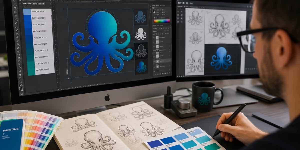
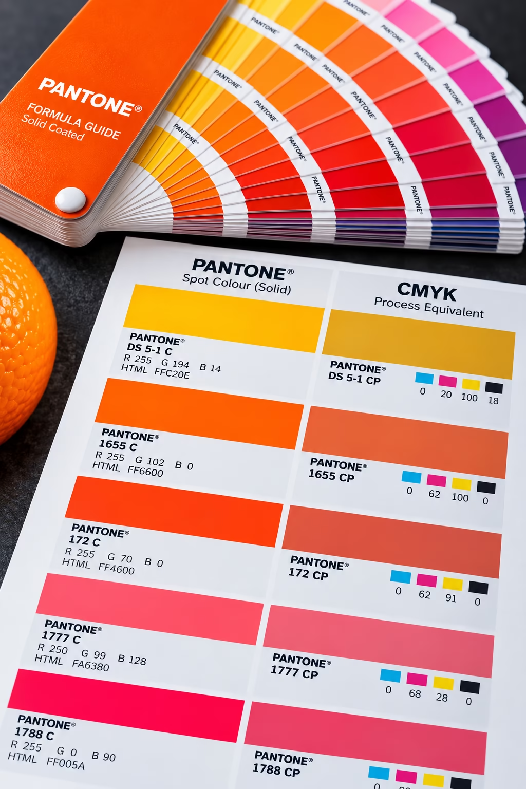
For critical brand colours, CMYK may not always provide sufficient consistency. Pantone® spot colours use specially mixed inks that produce more predictable results across different presses and print runs.
They’re commonly used for:
- corporate logos
- brand identity
- packaging
- signage
- premium marketing materials
Best practices for accurate colour printing
- Use the appropriate CMYK colour profile for your printing process.
- Use high-resolution images.
- Use high-quality, high-resolution images.
- Calibrate your monitor regularly.
- Work with the correct ICC profile.
- Soft proof before exporting your PDF.
- Avoid highly saturated RGB colours that fall outside the CMYK gamut.
- Request a printed proof for important projects.
- Use Pantone or similar spot colours when colour accuracy is critical.
[Pantone: Spot Color vs. Process Color Printing]
Print vs screen colours: Conclusion
Perfect colour matching between a monitor and a printed sheet is rarely possible because each uses a fundamentally different method of reproducing colour. Screens generate colour using RGB light, while commercial presses print with CMYK inks on paper. As a result, RGB can display colours that cannot be reproduced within the gamut of a particular CMYK printing process.
By understanding colour gamut, choosing the correct colour space, calibrating your monitor, using appropriate ICC profiles and proofing your artwork before production, you can achieve far more consistent and predictable print results. If colour accuracy is important, never rely solely on what you see on screen. A professionally produced printed proof remains the most reliable way to assess the final appearance before committing to a full production run.
Explore the world of PrePress