What is colour management?
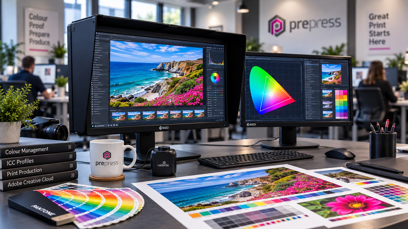
Colour management is the process of controlling colour as it moves between cameras, scanners, monitors, software and printing devices, using calibration, colour profiles and colour conversion to achieve predictable results.
When you take a photograph, scan an image, view it on a monitor and eventually print it, the colour you see can change at every stage. That is not necessarily because anything is wrong. A camera, scanner, monitor and printing press all reproduce colour in different ways. A monitor produces light, while a printed sheet reflects light. Different inks, papers, displays and printing processes also have different colour capabilities.
Colour management is the process of controlling these differences so that colour remains as consistent and predictable as possible throughout the workflow.
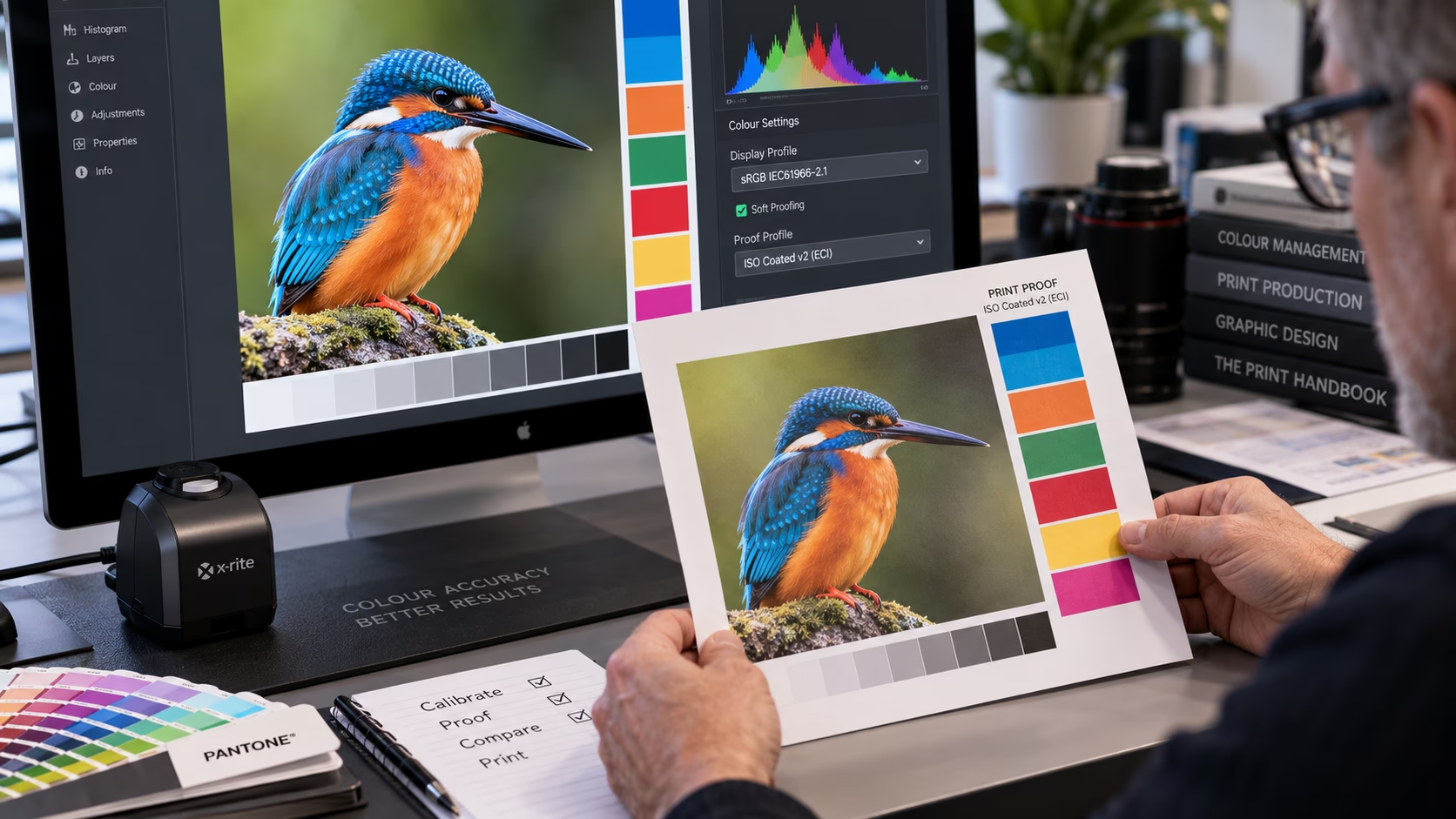
A screen and a printed sheet can never look physically identical because they produce colour in fundamentally different ways. With a properly calibrated and profiled display, however, you can obtain a remarkably accurate representation of how an image is likely to appear in print.
Why is colour management important?
Colour management becomes particularly important when colour accuracy matters. For a photographer, an incorrectly calibrated monitor can result in unnecessary adjustments to an otherwise good photograph. For a designer, an inaccurate display can lead to incorrect decisions about colour, brightness and contrast. For a printer, unexpected colour conversions can result in rework, waste and inconsistent results.
It is particularly important when working with brand colours. A corporate colour may need to be reproduced across a website, brochure, packaging, exhibition graphics and other printed materials. Although the colour may need to be reproduced differently on different devices and substrates, the objective is to maintain its intended appearance as closely as the process allows.
Colour management does not magically make every device reproduce the same colour. Instead, it allows colour-managed applications to understand how each device behaves and translate colour appropriately between them.
Why can’t my screen match my print?
This is one of the most common questions about colour. The fundamental reason is that a monitor and a printed sheet work differently. A monitor is an emissive device. It creates colour by producing light, normally using red, green and blue light.
A printed sheet is a reflective medium. It relies on inks or other colourants absorbing and reflecting light from the environment. The paper itself also makes a difference. The same ink can look different on coated and uncoated paper, and the appearance of a printed colour can change according to the lighting under which it is viewed.
A properly calibrated display can therefore give you a very good indication of the intended result, but it is not a replacement for viewing a physical proof under suitable lighting when colour is critical.
Why does colour management matter in a professional workflow?
In a traditional photograph-to-print workflow, colour passes through several stages:
Camera or scanner → monitor → image-editing software → page layout → proof → printing
Every stage introduces the possibility of a difference in colour reproduction.
A colour-managed workflow provides the information needed for each stage to understand the colour it is receiving and how it should be displayed or reproduced. This is particularly important when several people or organisations are involved in a job. The photographer, designer, prepress operator and printer may all be working on different equipment, but they can work from the same colour-management principles.
What is calibration?
Calibration is the process of adjusting a device towards a defined target. For a monitor, this can involve settings such as:
- luminance
- white point
- tonal response
- brightness
- RGB gain controls, where available
The objective is to make the display behave in a known and repeatable way. Calibration is not simply a matter of making the screen look good to your eye. Human vision adapts constantly to changes in colour and lighting, which makes visual calibration unreliable for colour-critical work. A hardware measurement device provides a much more objective method.
What is profiling?
Profiling is different from calibration.Profiling measures how a device actually behaves and creates an ICC profiledescribing that behaviour.The colour-management system can then use the profile when displaying or converting colour. In simple terms:
Calibration adjusts the device.
Profiling describes the device.
Both are important parts of a colour-managed workflow.
What is an ICC profile?
An ICC profile is a standardised description of the colour characteristics of a device or colour space.It allows colour-management software to understand what particular colour values mean and how they should be translated when moving between devices and colour spaces.
An RGB value by itself is simply a set of numbers. Its meaning depends on the colour space or profile associated with it. For example, the same RGB numbers in sRGB and Adobe RGB do not necessarily represent exactly the same colour.
ICC profiles can describe:
- monitors and displays
- scanners and other input devices
- RGB colour spaces
- CMYK printing conditions
- printers and output devices
- proofing conditions
The International Color Consortium provides the specifications and standards used for ICC-based colour management. The organisation was established in 1993 with the objective of creating an open, vendor-neutral approach to colour management across different systems and applications.
A little history of colour management
The early years of digital imaging presented a major problem: different manufacturers and software systems had their own methods of describing colour. The development of the ICC specification provided a common framework for describing colour characteristics and translating colour between devices.
Apple was one of the organisations involved in the formation of the consortium in 1993, building on the work surrounding ColorSync. This was a significant development in digital imaging and prepress because colour information could increasingly be carried through an entire workflow without being tied to one manufacturer’s proprietary system.
What is a colour space?
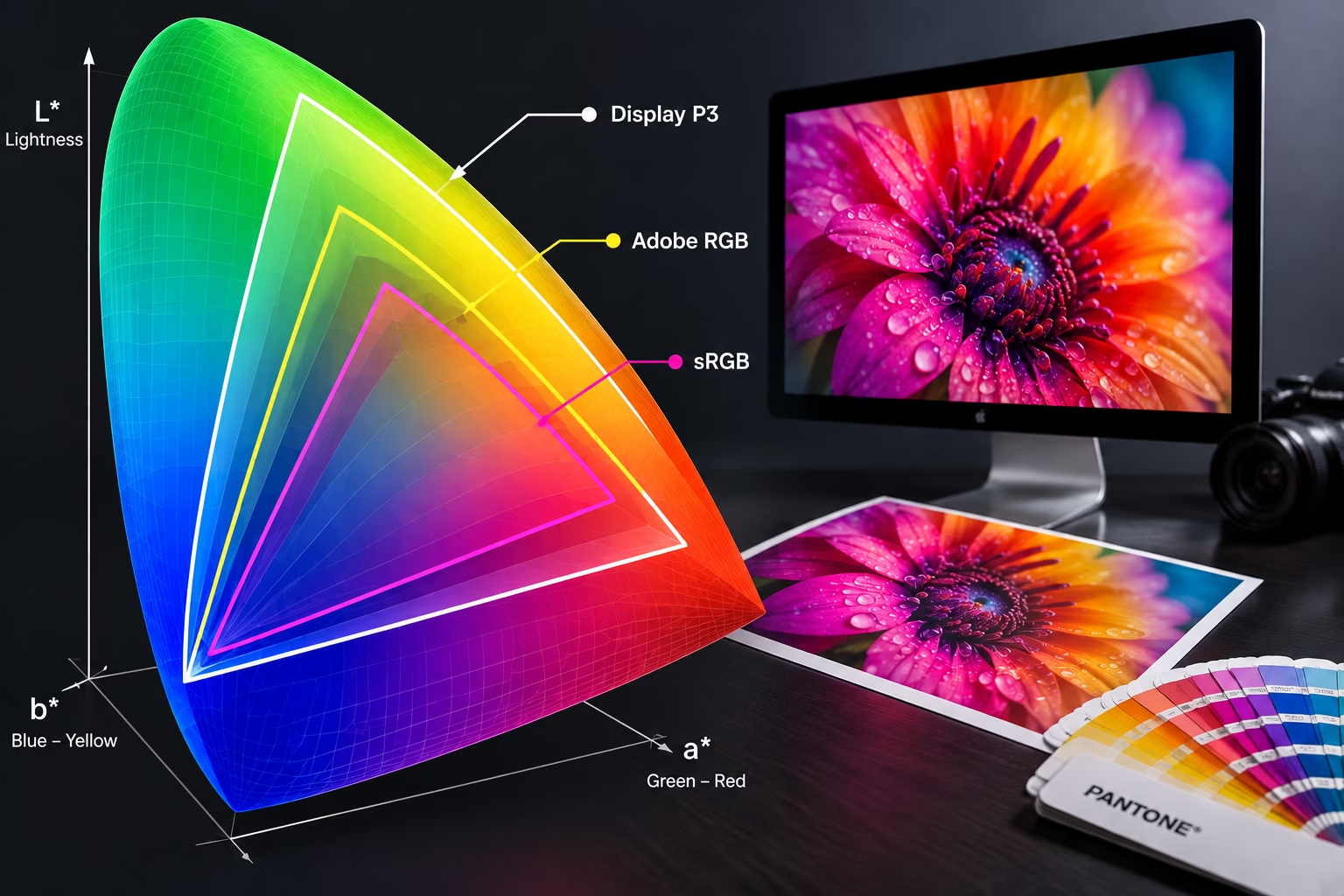
A colour space defines a particular way of representing colour. Common RGB colour spaces include:
- sRGB – widely used for websites, general digital images and consumer devices
- Adobe RGB (1998) – a wider RGB colour space often used in photography and print workflows
- Display P3 – a wide-gamut colour space increasingly used by modern displays and digital devices
CMYK is different
A CMYK profile generally describes a particular printing condition rather than being a universal definition of CMYK. This is why there is no single CMYK setting that is automatically correct for every printing job. The appropriate CMYK profile can depend on the printing process, press conditions, inks, paper and the requirements of the printer.
What is a colour gamut?
A colour gamut is the range of colours that a device or colour space can reproduce. Different devices have different gamuts. A modern wide-gamut monitor may be capable of displaying colours that cannot be reproduced by a particular CMYK printing process. When a colour falls outside the gamut of the destination device, colour-management software has to determine how best to represent it. This is where colour conversion and rendering intents become important.
What is colour conversion?
Colour conversion is the process of translating colour from one colour space to another. For example, an image might move through a workflow such as:
Camera → RGB working space → Photoshop → InDesign → CMYK printing condition
At each stage, profiles provide information about the source and destination colour spaces. The objective is not necessarily to preserve the numerical values. The objective is to preserve the intended appearance as closely as possible within the limitations of the destination device.
What is soft proofing?
Soft proofing allows you to preview how an image or document is likely to appear under a particular output condition. For example, Photoshop can simulate how an image may appear when reproduced using a particular CMYK printing profile.
This can reveal colours that are outside the printer’s gamut before the job is produced. Soft proofing is extremely useful, but it is important to understand what it is doing. It is a simulation, not a physical proof. Its accuracy depends upon the quality of the profiles, the calibration of the display and the viewing conditions.
For colour-critical work, a physical proof may still be appropriate.
Do I need colour management?
If colour is important to your work, the answer is generally yes. Colour management becomes particularly valuable if:
- You produce your own prints – particularly photographic, fine-art or high-quality commercial work.
- You work with brand colours – where colour consistency is important across different media.
- You prepare files for commercial printing – where the destination printing process needs to be understood.
- You work with photography – where accurate monitor calibration affects editing decisions.
- You work across multiple devices – particularly when moving between cameras, displays and print.
- You regularly send artwork to different printers – where different printing conditions may require different profiles.
You do not necessarily need an expensive colour-management system for every job. The level of control required should reflect the importance of colour accuracy and the type of work being produced.
How does calibration help your workflow?
A calibrated and profiled monitor gives you a known reference when making colour decisions. It does not change the RGB or CMYK values in your files. Instead, it helps the colour-managed application display those values predictably.
This is particularly important when editing photographs or using soft proofing. If you are working on two monitors, each display should be calibrated and profiled individually. Two monitors of the same model can still behave differently. In a studio with multiple displays, maintaining consistent calibration can become an ongoing part of the workflow.
What equipment do I need?
You do not necessarily need the most expensive equipment available. For colour-critical work, look for a display with:
- a stable and consistent panel
- good colour uniformity
- an appropriate colour gamut
- reliable calibration or profiling support
- sufficient resolution for your work
- sensible control over luminance and white point
Professional colour-management monitors are specifically designed for demanding colour workflows. Good general-purpose displays can also produce useful results when correctly profiled, but may provide less control over uniformity, calibration and viewing conditions. The important thing is not simply to buy the most expensive monitor.
A good display that is correctly calibrated and profiled is far more useful than an expensive display that is simply running with its factory settings.
Colour monitors for colour-critical work
The following monitors are examples of the type of equipment available for colour-critical work. They are included as a starting point rather than as a recommendation or ranking. Specifications and models change, so always check the manufacturer’s current information before purchasing. Some are on the expensive side.
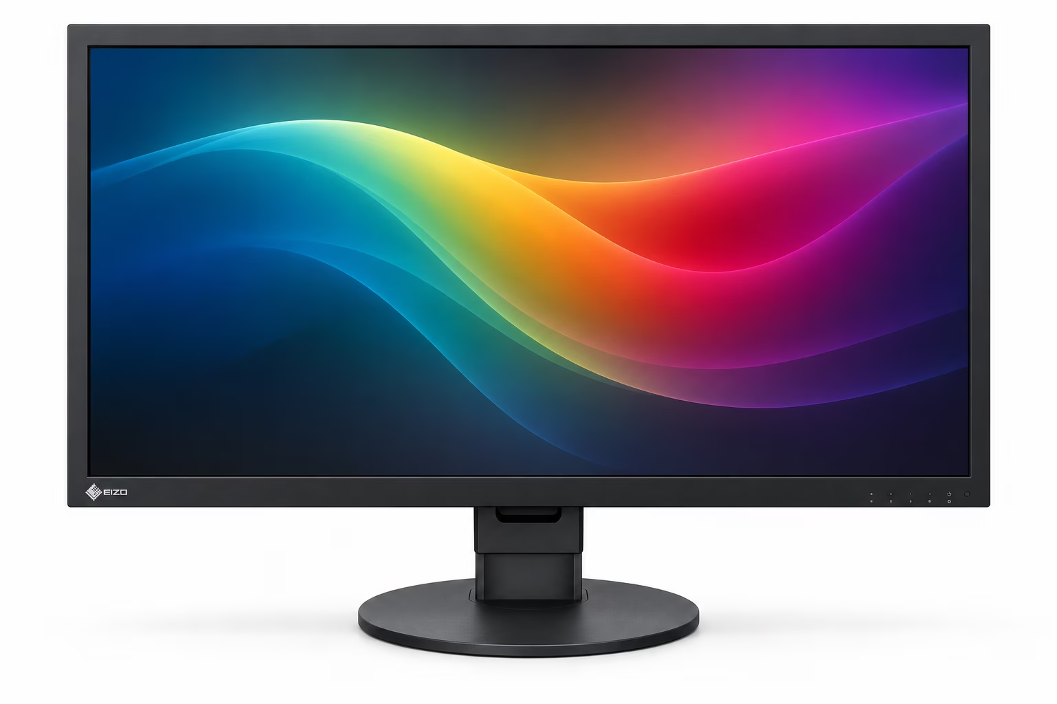
EIZO ColorEdge CG2700X
- Size: 27-inch
- Resolution: 3840 × 2160 4K UHD
- Colour gamut: 99% Adobe RGB, 98% DCI-P3
- Calibration: Built-in calibration sensor
- Other features: Hardware calibration, uniformity correction, 3D LUT and support for professional print and video workflows
The CG2700X is specifically designed as a professional colour-management display and includes an integrated calibration sensor.
See it in action: https://www.youtube.com/watch?v=IFkKU2FZ3kc
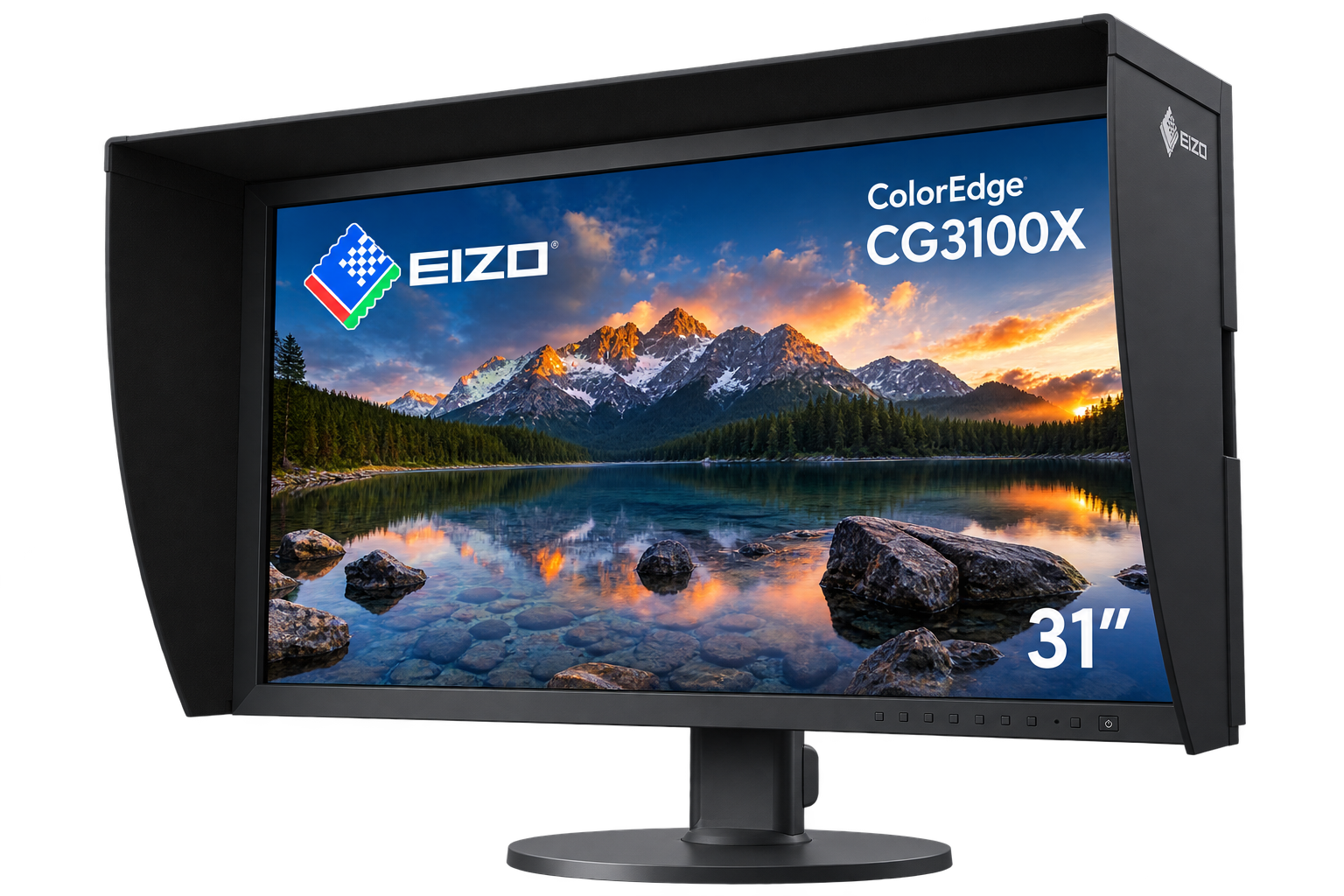
EIZO ColorEdge CG3100X
- Size: 30.5-inch
- Resolution: 4096 × 2160 DCI 4K
- Colour gamut: 97% Adobe RGB, 99% DCI-P3
- Calibration: Built-in calibration sensor
- Other features: Designed for high-end photography, prepress and post-production
EIZO’s current ColorEdge range also includes the CG3100X and other specialist displays for professional colour work.
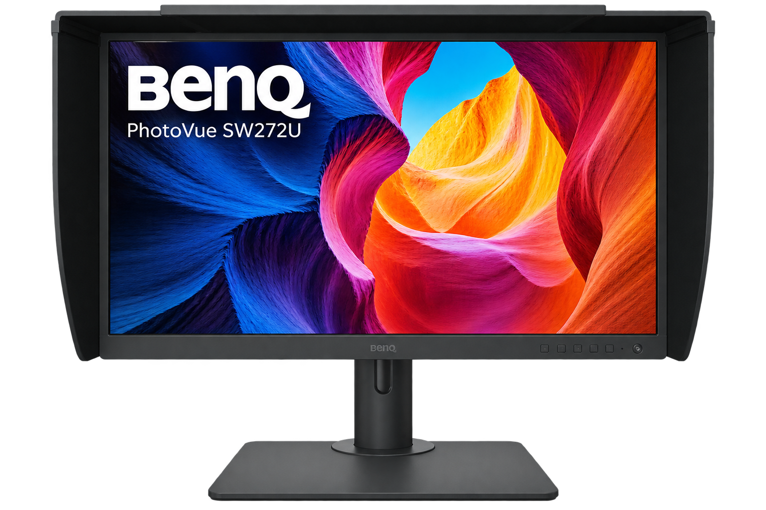
BenQ PhotoVue SW272U
- Size: 27-inch
- Resolution: 3840 × 2160 4K UHD
- Colour gamut: 99% Adobe RGB, 99% P3, 100% sRGB
- Calibration: Hardware calibration support
- Other features: Paper Color Sync, multiple colour modes and a shading hood
The SW272U is designed specifically for photography and colour-critical creative work.
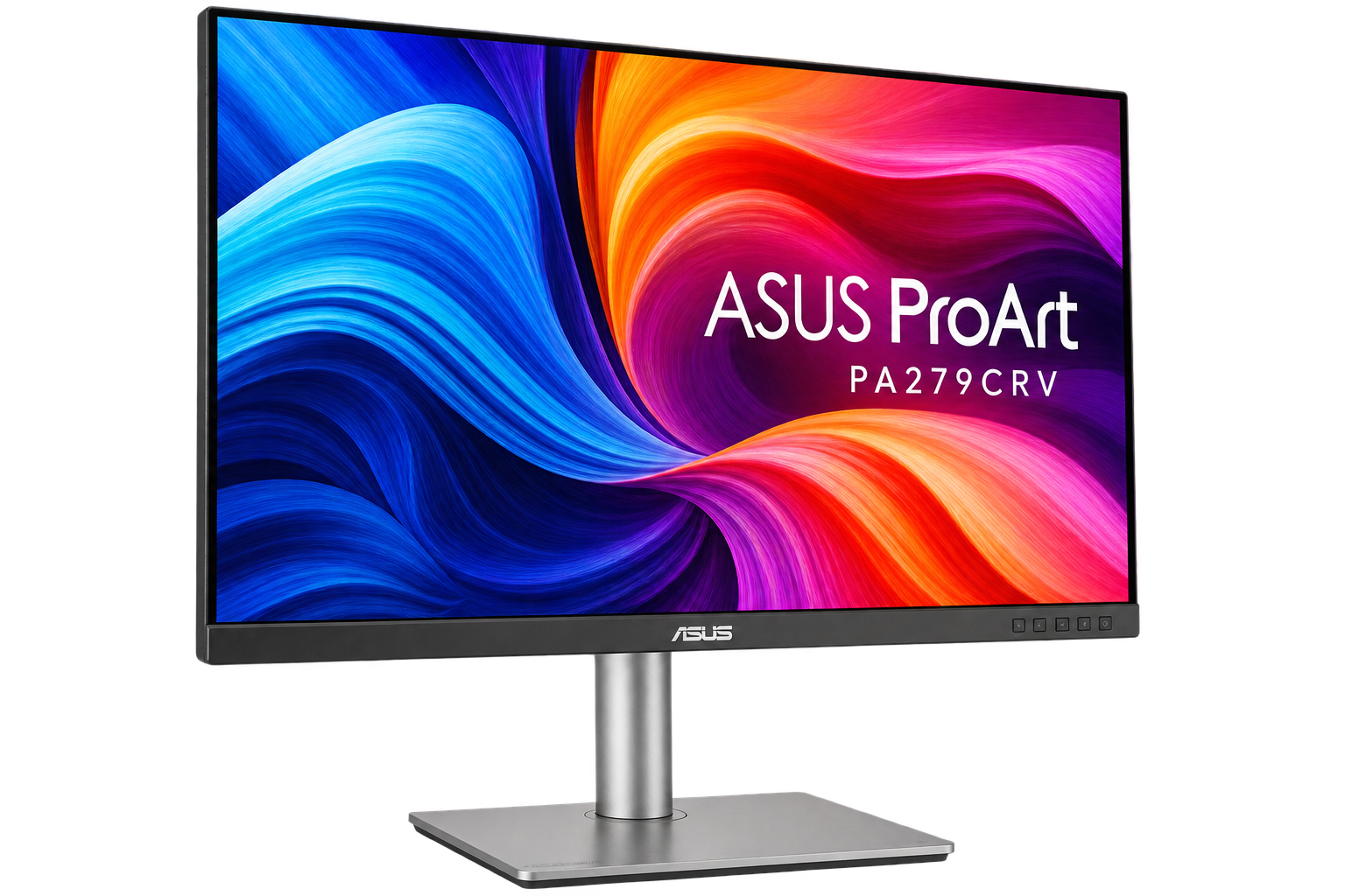
ASUS ProArt PA279CRV
- Size: 27-inch
- Resolution: 3840 × 2160 4K UHD
- Colour gamut: 99% Adobe RGB, 99% DCI-P3, 100% sRGB
- Colour accuracy: ASUS specifies ΔE < 2
- Other features: USB-C connectivity, ProArt colour modes and hardware colour controls
This is an example of a more accessible professional-oriented display rather than a specialist reference monitor.
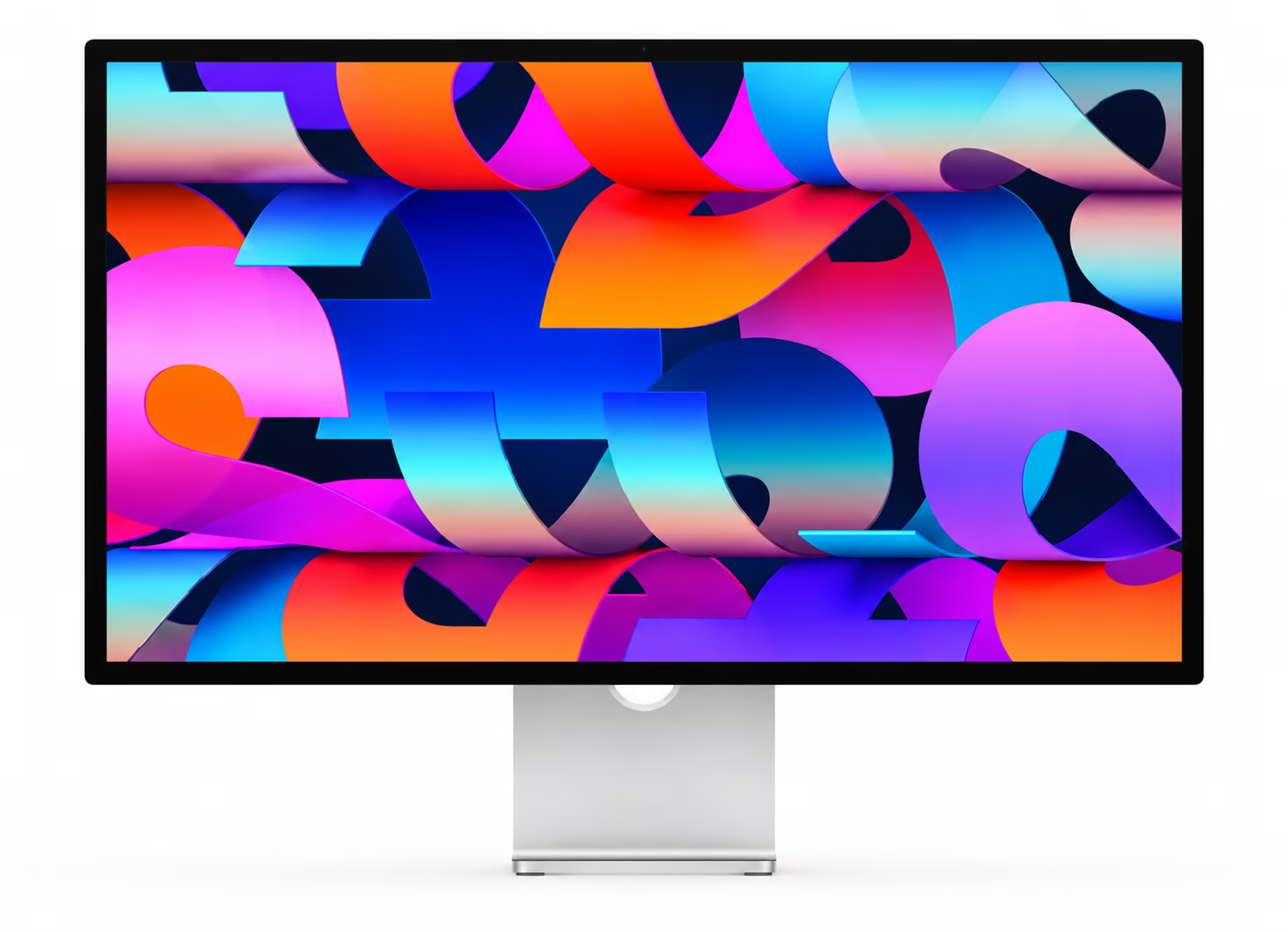
Apple Studio Display
- Size: 27-inch
- Resolution: 5120 × 2880 5K
- Colour: Wide-gamut P3
- Brightness: 600 nits
- Reference modes: Includes Design and Print (P3-D50), Photography (P3-D65) and Internet and Web (sRGB)
For Mac-based designers, the Studio Display is particularly interesting because Apple provides dedicated reference modes for different workflows, including design and print.
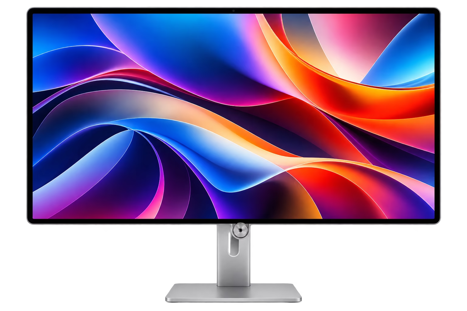
Apple Studio Display XDR
- Size: 27-inch
- Resolution: 5120 × 2880 5K
- Panel: Mini-LED with 2,304 dimming zones
- Brightness: Up to 1,000 nits SDR and 2,000 nits peak HDR
- Colour: P3 and Adobe RGB wide colour gamuts
- Reference modes: Includes Design and Print modes for both P3 and Adobe RGB
Introduced in 2026, the Studio Display XDR is aimed at workflows requiring a wider gamut and substantially higher brightness, particularly HDR and demanding photographic or video work.
The important point is to distinguish between a general professional display and a specialist colour-reference monitor. They are not necessarily intended for the same level of colour-critical work.
Choosing between different monitors
There is no universal “best” colour monitor. The appropriate display depends upon what you are doing.A photographer may prioritise a wide Adobe RGB gamut and uniformity. A graphic designer may place greater emphasis on 4K or 5K resolution, workspace and accurate print simulation. A video editor may require DCI-P3, Rec.709 or HDR capabilities.
For commercial prepress, the ability to calibrate and profile the display reliably can be more important than having the highest specification on the box. The display should therefore be considered as part of the entire colour-management system rather than as an isolated purchase.
Calibration devices
If your monitor does not have a suitable built-in calibration system, a hardware measurement device is an important part of a colour-critical workflow.
The following are examples of currently available devices.
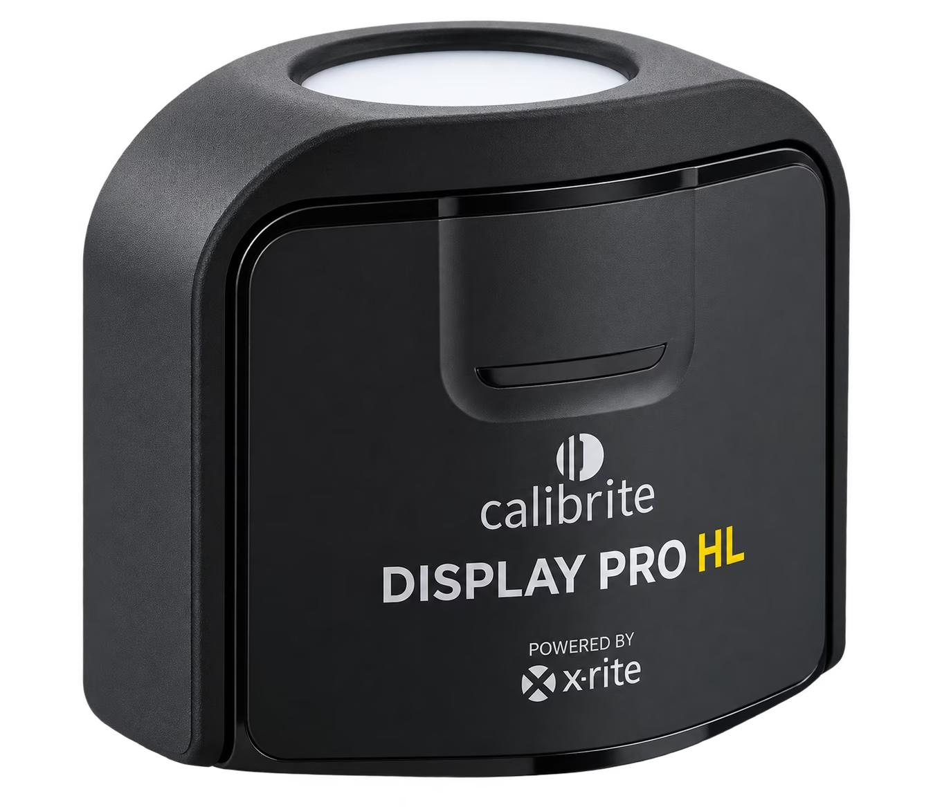
Calibrite Display Pro HL
The Display Pro HL is a current professional display calibration device designed for modern LCD, mini-LED and OLED displays, including Apple XDR panels.
It can measure displays up to 3,000 nits and works with Calibrite PROFILER software. It provides control over targets such as white point, luminance, contrast and gamma.
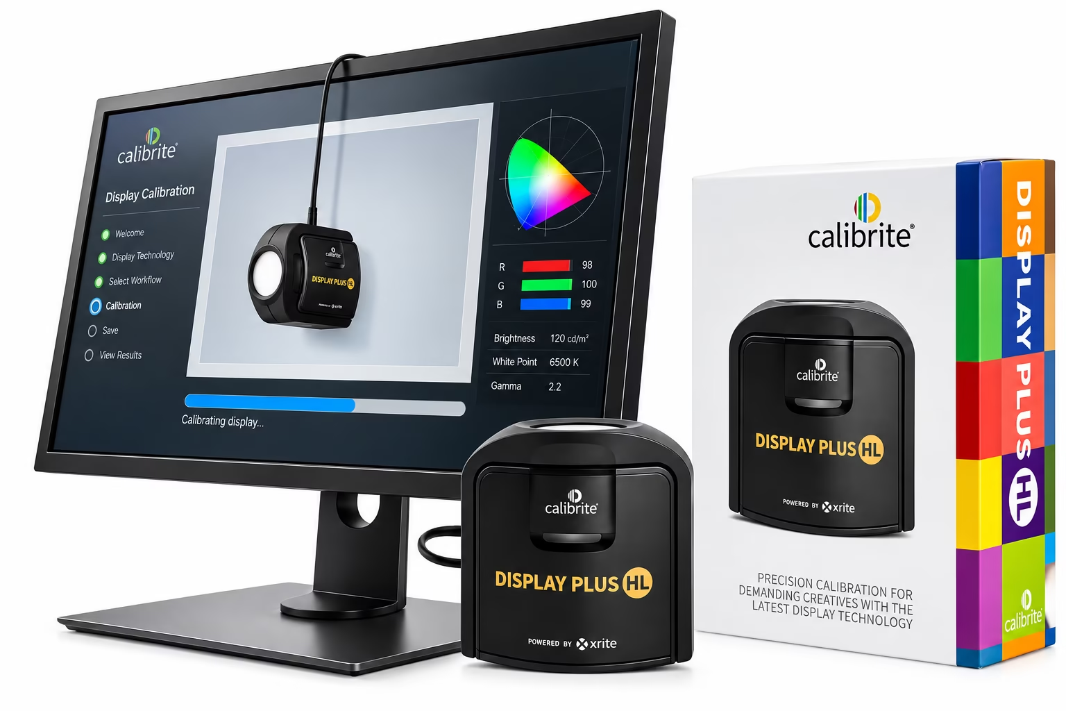
Calibrite Display Plus HL
The Display Plus HL is intended for particularly high-luminance displays and can measure up to 10,000 nits.
It is aimed at demanding photography, design and video workflows where very bright modern displays need to be measured accurately.
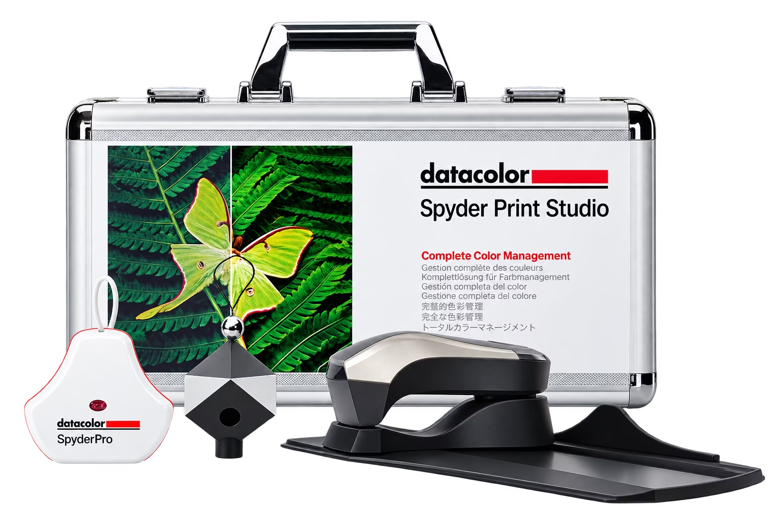
Datacolor Spyder Print Studio
The Datacolor Spyder Print Studio is an essential all-in-one photographic workflow tool suite for precision colour control from image capture through editing, to flawless print results. For photographers seeking maximum control of their entire photographic workflow from capture, to editing, to print.
Other calibration systems
There are other professional colour-management systems available, including instruments designed for displays, projectors and printer profiling.
The important consideration is not simply which brand you buy, but whether the device supports your display technology and provides the level of control required by your workflow.
Why use a hardware calibration device?
Accuracy
Visual adjustments rely on human vision, which adapts to surrounding colour and lighting. A measurement device provides objective measurements instead.
Consistency
A hardware calibration system allows you to establish repeatable targets rather than relying on visual judgement.
Multi-monitor matching
When using multiple displays, each screen can be measured and profiled individually so that they can be brought much closer together in appearance.
Verification
Many current calibration systems can also check the display after calibration to determine whether it is still performing within the desired tolerance.
Display system optimisation
Setting up the display correctly is only part of the process. The screen should be positioned in a sensible environment with controlled lighting where possible. Avoid strong light falling directly onto the screen and be aware that daylight changes throughout the day.
Prints are particularly affected by their surroundings because they reflect the light falling on them. For critical work, the lighting used to assess a print should therefore be considered alongside the calibration of the display.
White point and luminance targets should be selected to suit the intended workflow and viewing environment rather than simply accepting a value because it is a commonly quoted setting.
Adobe colour management
Adobe Creative Cloud applications are designed to work with colour-managed workflows. If you use Photoshop, Illustrator and InDesign, it is important that they use compatible colour settings.
Adobe Bridge can be used to synchronise colour settings across compatible Adobe applications, helping prevent different applications from interpreting colour differently. The exact colour settings should depend upon the work being produced.
A photographic workflow, web workflow and commercial print workflow can have different requirements. There is therefore no single Adobe colour setting that is correct for every job.
Adobe Bridge and synchronised colour settings
Adobe Bridge provides a central place for managing and synchronising colour settings across Adobe applications.
A typical workflow is:
- Open Adobe Bridge.
- Open the colour-management settings.
- Select the configuration appropriate to your workflow.
- Apply the settings.
- Check that Photoshop, Illustrator and InDesign are synchronised.
For professional print production, always consider the destination printing process and any colour profiles supplied by the printer.
Choosing a CMYK profile for print
One of the most common mistakes in print production is assuming that every job should use the same CMYK profile. That is not the case. The appropriate profile can depend on:
- the printing process
- the press
- the ink set
- the paper or substrate
- the printing standard
- the intended colour reproduction
- the printer’s workflow
If a printer or production facility supplies a specific ICC profile for a job, use the profile they specify.
Do not convert an RGB photograph to an arbitrary CMYK profile simply because it is the one installed on your computer. For some workflows, a printer may prefer to receive correctly profiled RGB images and manage the final conversion themselves. In other workflows, the designer or prepress operator may be expected to supply CMYK artwork. The correct approach is therefore to understand the destination rather than blindly applying a particular profile.
Embedded profiles matter
When a colour profile is embedded in an image, the receiving application has information about how the colour values should be interpreted.
Without a profile, an application may have to make assumptions about what those numbers mean. For this reason, embedded profiles are an important part of a colour-managed workflow. A simple rule is:
Don’t remove a colour profile unless you have a specific reason to do so.
What about CMYK numbers?
CMYK numbers can be extremely important in print production. For example, a corporate colour specified as a particular CMYK percentage may need to remain unchanged through a production workflow. Colour management does not mean that everything should automatically be converted. Sometimes the correct approach is to preserve the colour numbers deliberately. This is particularly important with:
- logos
- corporate colours
- black text
- registration-sensitive elements
- packaging
- spot-colour replacements
- artwork supplied by professional printers
Understanding when to convert colour and when to preserve colour values is an important part of professional prepress.
Rendering intents
When converting between colour spaces, some source colours may fall outside the gamut of the destination. A rendering intent determines how the colour-management system deals with those colours. The main rendering intents are:
- Perceptual – adjusts colours so that the overall relationship between colours is maintained.
- Relative Colorimetric – preserves colours that can be reproduced while mapping out-of-gamut colours to the destination gamut.
- Absolute Colorimetric – similar to Relative Colorimetric but also attempts to reproduce the source white point, making it particularly useful in some proofing applications.
- Saturation – prioritises vividness and is generally more relevant to graphics where saturation is more important than exact colour accuracy.
There is no single rendering intent that is automatically correct for every image or workflow.
The four important stages of colour management
Although colour management is a complex subject, four concepts are particularly useful to understand.
Calibration
Adjust the device towards a defined target.
Characterisation
Measure how the device or process actually behaves.
Profiling
Create an ICC profile describing that behaviour.
Conversion
Translate colour between source and destination colour spaces while attempting to preserve the intended appearance.
Together, these processes allow different devices and applications to work together in a predictable colour-managed workflow.
Colour management glossary
Calibration
The process of adjusting a device towards a defined target behaviour.
Characterisation
The process of measuring the actual colour behaviour of a device or process.
Colour gamut
The range of colours that a particular device or colour space can reproduce.
Colour profile
A description of how a device or colour space represents colour.
Colour space
A defined system for representing colour, such as sRGB, Adobe RGB or a particular CMYK printing condition.
Colour conversion
The process of translating colour from one colour space to another.
Colorimeter
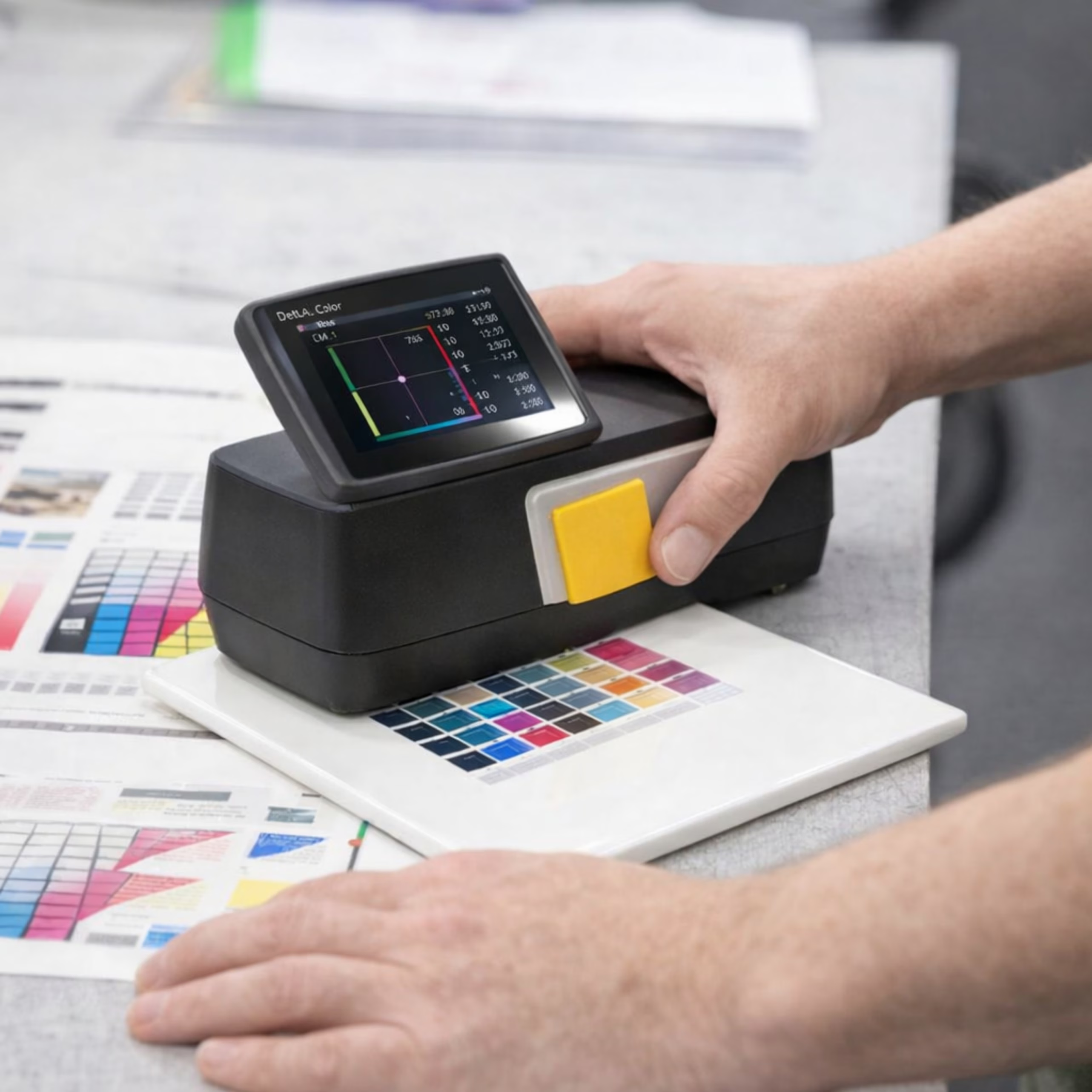
A measurement device commonly used to calibrate and profile displays.
Delta E (ΔE)
A numerical measurement of the difference between two colours. Lower values indicate a smaller measured difference, although the visual significance depends on the colour, measurement method and viewing conditions.
ICC profile
A standardised profile used by colour-management systems to describe colour characteristics and enable translation between colour spaces.
Luminance
The amount of light emitted or reflected from a surface, commonly expressed in cd/m² or nits.
Rendering intent
The method used when converting colours between colour spaces, particularly when the source contains colours outside the gamut of the destination.
Soft proof
A screen-based simulation of how artwork or an image may appear under a particular output condition.
White point
The reference white used by a display or colour-management system, normally expressed using a standard such as D50 or D65.
Working space
The colour space used by an application as an intermediate environment for editing and managing colour.
Keep an original master
One of the best habits in digital imaging is to keep an original master. Just because an image is being prepared for a particular printing process today does not mean that it should be permanently converted and overwritten.
Where possible, keep the original high-gamut version and work from a copy when preparing files for specific destinations. For photographs, retain the RAW file where available. You may need a CMYK version for a brochure today, an RGB version for a website tomorrow and a different output profile for packaging in the future. Once colour information has been clipped or converted unnecessarily, it may not be possible to recover it.
Keep the original. Prepare output versions from it.
Finally
Colour management is not about making every screen, printer and piece of paper produce identical colour. It is about understanding the differences between them and managing those differences so that colour remains as predictable as possible throughout the workflow.
A properly calibrated and profiled monitor, appropriate ICC profiles, sensible application settings and an understanding of the final printing process can remove much of the guesswork from digital colour. And when colour really matters, remember one of the most important rules in print: The best colour workflow starts with knowing where the job is going to end up.