CMYK or RGB
Which Colour Mode Should You Use?
Learn the difference between CMYK and RGB colour modes, when to use each, and how to prepare your design files correctly for print and digital projects.
To save you reading further, the short answer is CMYK.
Understanding a few basic print standards can save time, avoid production delays, and help ensure your printed job matches your expectations.
CMYK or RGB
We have heard it countless times: “Can I send my file in RGB because it looks great on my monitor?” Unfortunately, not always.
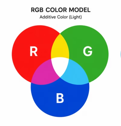
RGB (Red, Green, Blue) is a colour model designed for light-emitting devices such as computer monitors, tablets, smartphones, and televisions. It creates colour through an additive process, where different intensities of red, green, and blue light are combined to produce the colours we see on screen. Because RGB uses light, it can reproduce a wider range of colours—particularly bright, highly saturated colours—than most printing processes.
A standard RGB colour space such as sRGB can define over 16 million possible colour values. However, the number of colours a display can show depends on its technology, calibration, brightness, and colour gamut. Although the human eye can perceive millions of distinct colours, no RGB display reproduces the entire range of colours visible to human vision.
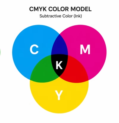
CMYK (Cyan, Magenta, Yellow, and Key/Black) is the colour model used in commercial printing. Unlike RGB, CMYK uses inks on a physical surface and works through subtractive colour mixing. Instead of adding light, inks absorb certain wavelengths of light and reflect others back to our eyes. This process naturally produces a smaller colour gamut than light-based RGB systems.
As a result, some colours that look vibrant on a monitor—especially intense blues, greens, oranges, and neon tones—may not be achievable with standard CMYK inks and can appear less bright or more muted when printed. Professional printers use colour management, calibrated equipment, and specialised ink systems where necessary to achieve the closest possible match.
The key difference is simple: RGB is designed for light, while CMYK is designed for ink. A colour that looks perfect on screen may not be physically reproducible on paper, which is why print files should always be prepared using the correct colour settings and checked with proper colour management before production.
When an RGB file is sent for print, it must be converted to CMYK. During this conversion, colours that fall outside the CMYK colour gamut are replaced with the closest printable equivalent. This often results in noticeable colour shifts, particularly with bright blues, greens, oranges, and fluorescent-looking colours.
Many commercial printers will flag RGB images during prepress rather than automatically converting them. This is because automatic conversions can lead to customer complaints when printed colours do not match the screen colours. Please also remember the colour are seen buy your eyes differently, print of reflective and screen.
If a prepress department converts any file to CMYK, the process itself is straightforward, but the printed result may still differ from your original design. If the artwork contains colour-critical elements such as logos, brand colours, or product images, a new proof may be required for approval, which can add both time and cost to the job.
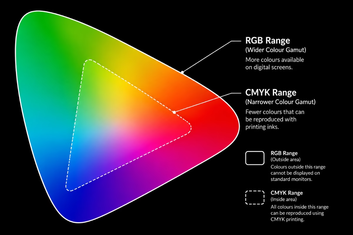
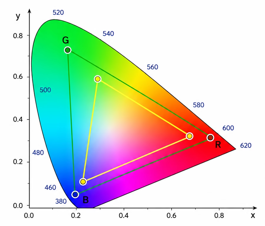
The image to the right show the RGB and CMYK range, placed over each other. The Visible range, that the naked eye can see is far larger than both these areas
Print is a subtractive colour model. Printing applies ink onto paper, which then absorbs (or subtracts) varying wavelengths of light.
Screen colours RGB, is an additive colour model used for digital screens (like TVs, phones, and monitors) that creates colours by combining emissions of Red, Green, and Blue light. Because it starts with a dark screen (no light), mixing the colours at full intensity adds them together to create pure white.
Right: Shows RGB vs CMYK and secondly the whole visible colour spectrum with the relevant RGB and Colour areas. It clearly shows substantially less colour availability in the CMYK model.
How CMYK and RGB Work Together
When creating artwork for digital screens, designers typically work in RGB (Red, Green, Blue), as screens use light to display colours. RGB designs often appear brighter and more vibrant because colours are created through emitted light.
For printed materials, however, artwork needs to be prepared in CMYK (Cyan, Magenta, Yellow, Black), the colour mode used by professional printing processes. CMYK uses inks rather than light, which means the range of colours it can reproduce is different from RGB.
If artwork is created in RGB, it must be converted to CMYK before printing. During this conversion, some colours may change slightly as they are adjusted to fit within the CMYK colour range. Bright or highly saturated RGB colours are most likely to show noticeable differences.
For the best colour accuracy, we recommend creating your artwork in CMYK mode from the beginning for all print projects. This helps ensure your colours are prepared correctly for print and reduces the risk of unexpected colour changes during conversion.
In Short
- CMYK uses a subtractive colour model, meaning it creates colours by absorbing light.
It is primarily used for print because inks mix together on physical materials.
- RGB uses an additive colour model, meaning it creates colours by combining light.
It offers a wider colour range and is used for screens, websites and apps.
Best Practice
For the most predictable printing results:
- Create or convert your artwork to CMYK before supplying it for print.
- Use the correct ICC colour profile recommended by your printer.
- Always check colour-critical artwork with a printed proof where possible.
- If your client needs to match brand use a fish or sixth colour in print. (Pantone or similar)
Preparing your files correctly from the start helps ensure smoother production, fewer surprises, and colours that print as accurately as possible.
Image Resolution (DPI)
- Image resolution (PPI/DPI) ≈ 2 × the screen’s LPI (lines per inch).
- LPI (Lines Per Inch) refers to the halftone screen frequency used in printing.
- PPI (Pixels Per Inch) is the correct term for the resolution of a digital image.
- DPI (Dots Per Inch) refers to the printer’s output capability, although people often use “DPI” when they actually mean image resolution.
The minimum resolution you should set your image to at 100%
- 150 LPI print screen → 300 PPI image
- 175 LPI print screen → 350 PPI image
- 200 LPI print screen → 400 PPI image – We save all our images at this setting by default
The “2× LPI” rule (also known as the quality factor of 2) is based on the Nyquist sampling theorem and has long been the standard guideline in commercial printing. It recommends that image resolution be approximately twice the halftone screen ruling (LPI) to capture sufficient image detail for high-quality reproduction.
There are exceptions: Some workflows use 1.5× LPI to reduce file size with minimal visible quality loss. Very high-quality art books or stochastic/FM screening may use different recommendations. We use 600dpi@100%
What happens if my images have too much information/very large?
Nothing, you are just supplying a larger file. If print images contain too much information or are very large, they will still produce a high-quality print, but the larger file size may increase upload, download, storage, and processing times. Extremely large files can also slow down design software, printing workflows, and file transfers.
In modern printing, size does matter. A file should contain enough resolution and detail for the intended print size, but adding unnecessary information beyond what the printer can reproduce does not improve the final result. The goal is to provide an image with the appropriate resolution and quality for the specific print application.
What happens if my images have too little information/very small?
The file will print but with have jaggies. The image with be pixilated. Often these images are jpeg’s picked uo from the web which is another reason not to use JPEGs in print workflow.
Whilst JPEGs can be perfectly acceptable for print when saved at high quality and at the correct resolution or experience is that many companies fail to grasp that every save throws away detail. We advise never to use JPEGs in a design for print workflow.
I do not have another image, what can I do?
- Find the original: This is a good first step if you’re looking for a higher quality version of the image.
- Use an online service or Photoshop to increase size and clean up: While this is possible, it may not yield the best results and can sometimes make the image look worse. It’s often not recommended for significant detail recovery.
- Use AI to re-create: This is a viable option, especially with the advancements in AI technology for image generation, but results can vary depending on the complexity of the image.
Printing the correct colour for brand
Achieving consistent brand colours across different printing and digital processes can be challenging. Colours often change when converted between different colour systems, such as RGB, CMYK, RAL, and Changing Pantone colours to CMYK. Some colours convert accurately, while many many others do not.
A professional designer should consider this during the logo creation process and provide a brand guidelines document (brand book) that clearly defines how your colours should be reproduced. This should include the correct colour references and breakdowns for different applications, such as print, digital use, signage, and other production methods.
Unfortunately, many low-cost design services and some AI-generated design systems do not always consider colour management, print limitations, or brand consistency. This can result in logos that look correct on screen but fail to reproduce accurately in print.
If you have a logo that is not printing with the correct colours, you have several options:
If you have a specific Pantone colour reference:
Use a Pantone spot colour when printing . This is the most reliable way to achieve the exact brand colour because the printer uses a pre-mixed ink rather than creating the colour through CMYK combinations.
If a spot colour is not possible, ask your printer for advice
A professional print company should be able to recommend the closest CMYK, digital print, or production method to achieve the best possible match.
Create and test colour samples
If you cannot get suitable advice, create a test file containing multiple versions of your logo with slight colour variations. Have these printed and compare the results to your approved brand colour.
Many printers can include a colour test on another production run when there is available space, sometimes at little or no extra cost. The same approach applies to digital printing: test, adjust, and repeat until you achieve the closest possible match.
Remember that the final appearance of a colour is affected by many factors, including the printing process, paper or material type, surface finish, ink characteristics, and lighting conditions. The substrate (the material being printed on) is often one of the biggest reasons colours appear different from what you see on screen.
For the best results, always work from an approved brand colour reference and use a professional printer who understands colour management.